This is my personal breakdown of the current state of design tools as we have just passed the halfway mark in the year 2019. 2020 is upon us people, this is not a drill.
First, a very brief history of my experience...
I started my foray into computer graphic creation™ with a super early version of Photoshop in the 90s when "layers" was a new feature.
I used Photoshop, Illustrator, Fireworks, and InDesign during my Graphic Design studies throughout college. I continued to use Photoshop and Illustrator exclusively until Sketch gained more and more popularity amongst UI designers. It was 2014 when I finally moved to Sketch as my go-to tool over Photoshop and Illustrator.
Now in just 5 short years, in addition to Sketch we now have Figma, Adobe XD, Framer, InVision Studio, and probably lots of others that aren't on my radar yet.
Let's break it down, shall we?
Figma
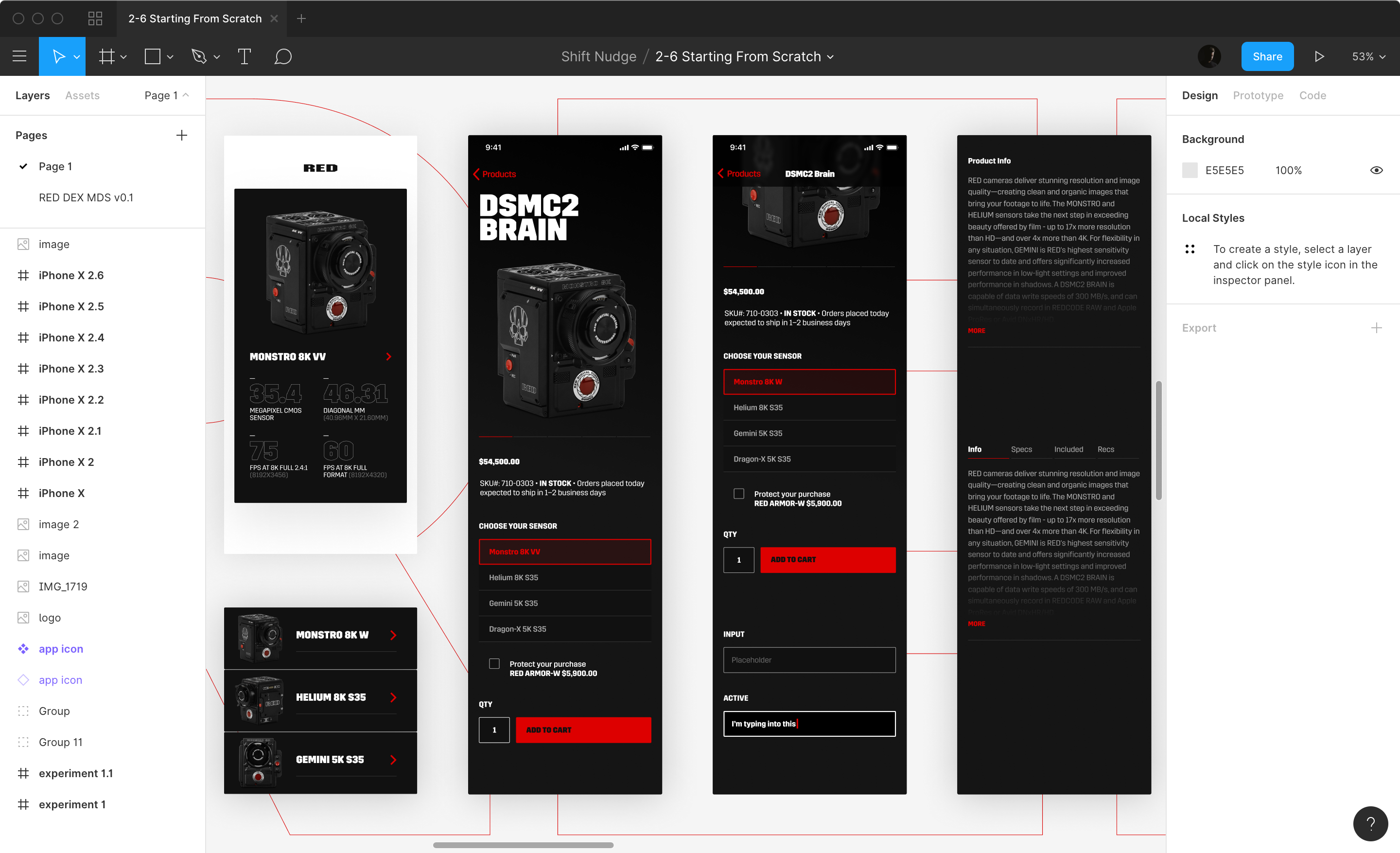 Figma has currently taken the lead as my favorite tool to use.
I was very opposed to the idea of a web-based tool for a long time, but I forced myself to give it a shot for the first-time for a full project when I designed the Streamline Icons website over year ago. Collaborating with Vincent was a breeze and I was surprised at just how fast and thoughtful the feature set was within the tool.
Fast forward a year and it's only gotten faster and better. The team at Figma really seems to be paying attention to those super nerdy designer details that appear small on the surface, but can have a profound effect on your day to day as a designer. Things like not needing to reselect a different text layer to edit that text, or the tidy up feature, or finding and replacing multiple layer names. Just lots and lots of delightfully available shortcuts and more.
The mobile mirroring tool is the only thing, that from time to time, will give me some hiccups and need to be restarted. Other than that I really have no gripes with the software. It's fast and highly functional. What more could you ask for?
Sketch
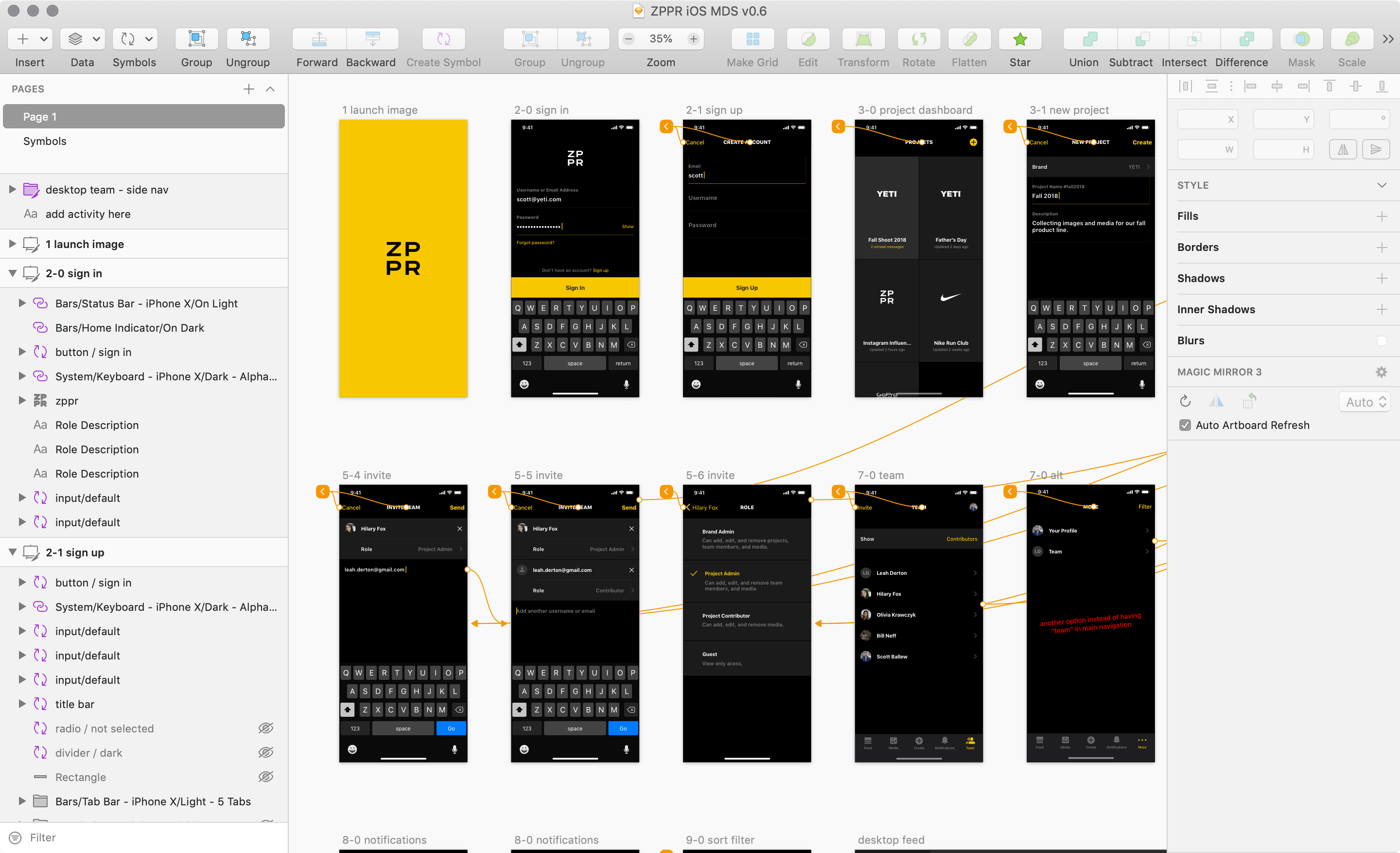 The thing I still like about Sketch over Figma is the fact that all symbols (or components) all get sent to a separate master symbol page. The mental model of having a separate master sheet makes a lot of sense to me and I miss that when not using Sketch.
I would be almost as happy doing daily work in Sketch compared to Figma, except for the fact that Sketch starts stalling out way more often than Figma. Perhaps because of the heavy use of CPU vs. GPU? It would seem that a natively built app should outperform a web-based app, but that has not been my experience with Sketch vs. Figma.
Which Mac is the best for product design? It depends. Here’s some extremely non-scientific tests using popular design tools, where I drew a bunch of boxes with strokes and rotated them. pic.twitter.com/kR4wNDppfL
— Marc Edwards (@marcedwards) July 17, 2019
The sheer amount of plugins available for Sketch is very appealing and there are several I miss when using Figma exclusively. I do think this will be solved for Figma as they're about to make their plugin ecosystem live within the next few days of this article's publication.
However, Sketch is iterating their software very quickly, it's still a joy to use and I'm excited for the future.
Adobe XD
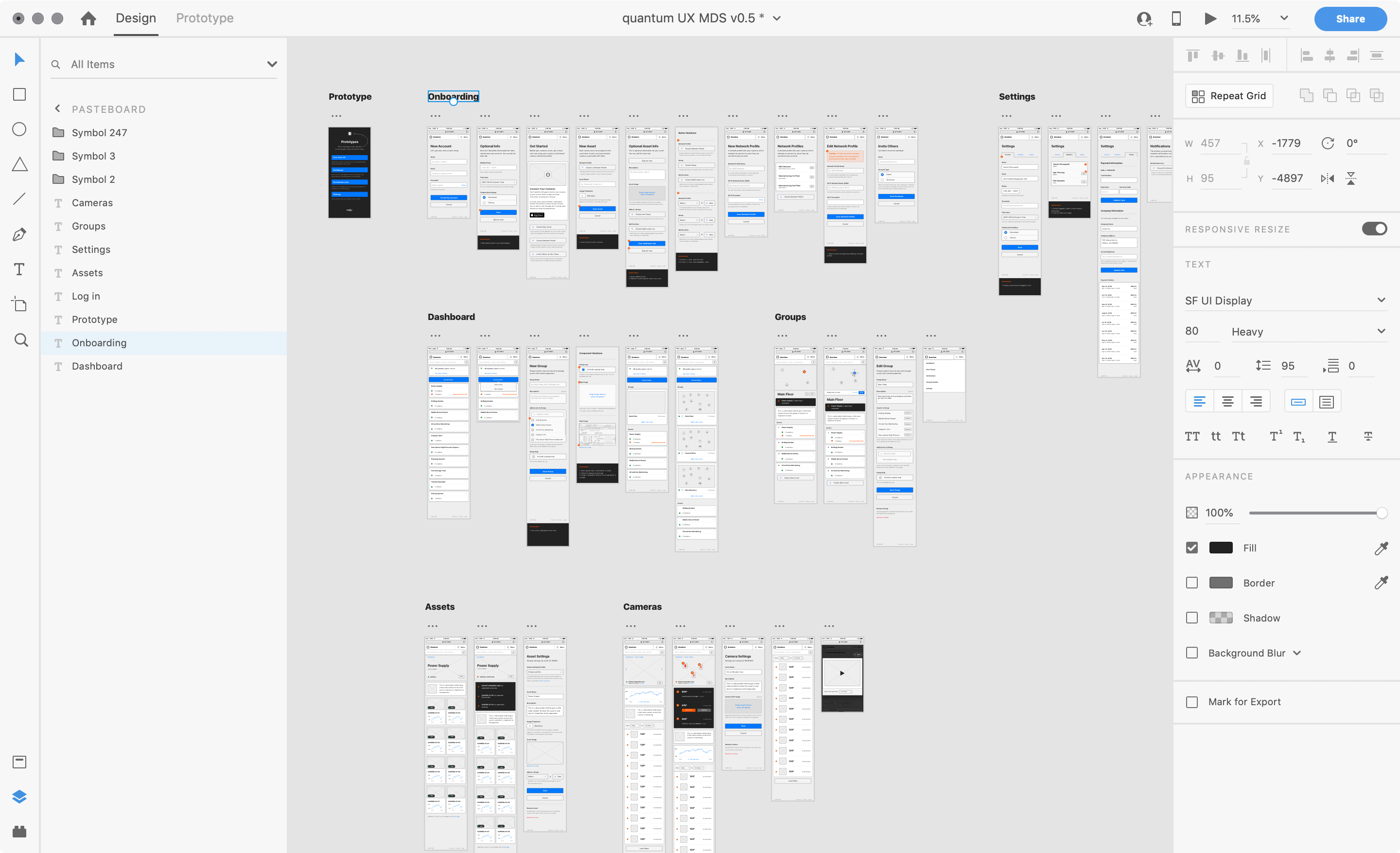 When Adobe XD first came out as Project Comet, I was honored to be a part of the Customer Advisory Board. I really really really wanted XD to be my go-to tool, combining the vector power of Adobe Illustrator with the simplicity of Sketch.
Adobe XD is absolutely lighting fast and hasn't once crashed on me that I can recall. Creating clickable prototypes is extremely fast as well and the recent addition of "auto-animate" as a transition effect, is really nice—though somewhat limiting if you're really trying to tweak animation sequences.
The frustrating thing about XD for me are the little things I use all the time that are missing. The fact I can't hit ⌘ nudge or ⌘ shift nudge for scaling objects. There is no ability to add inner shadows to objects. No ability to add multiple fills or borders for quick experimentation.
I can imagine that lots of these little niceties come with some type of performance cost and I do so appreciate XD's commitment to absolute lightning performance.
I'm sure within the year, a lot of my trite complaints will be gone with the wind.
InVision Studio
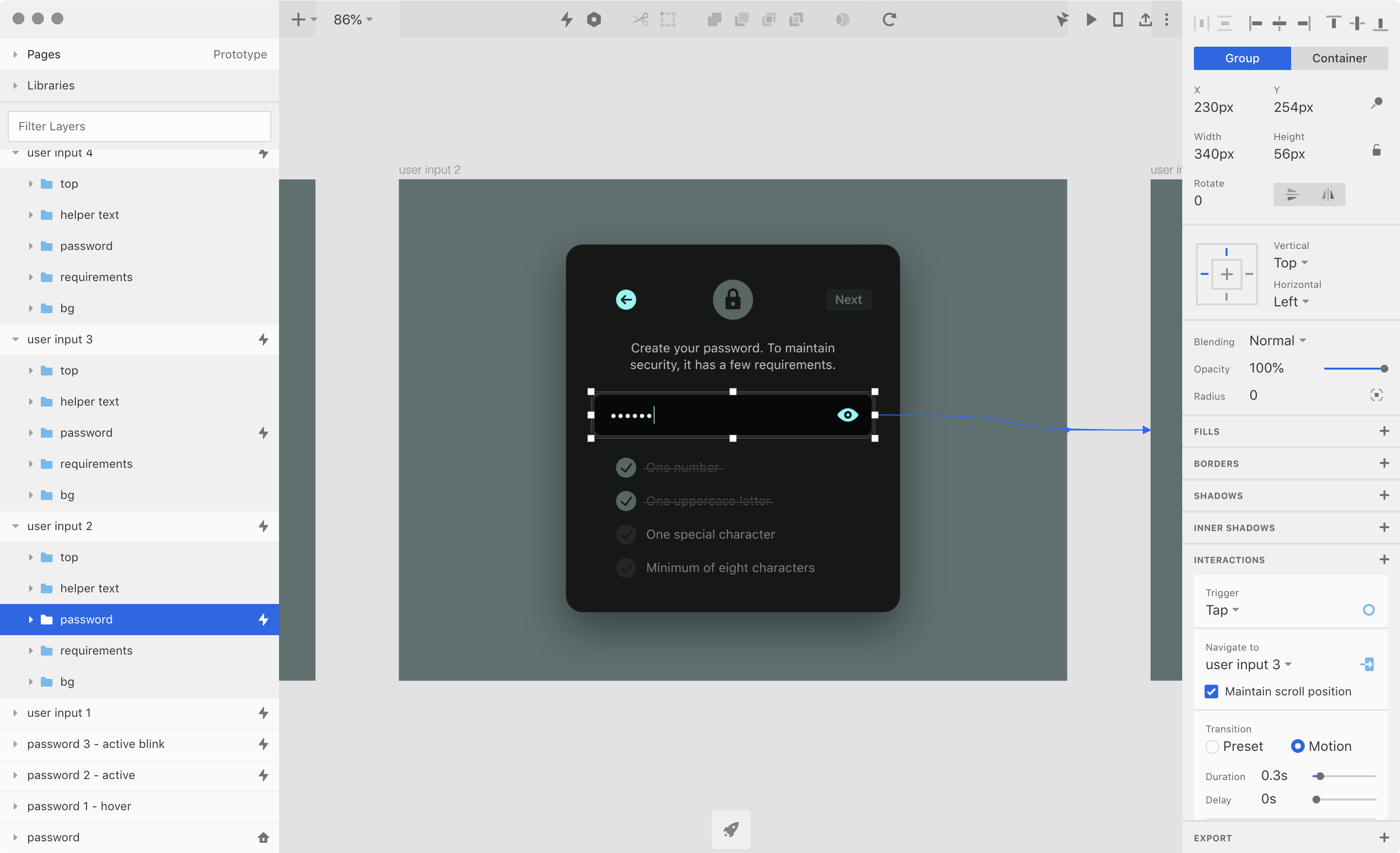 Studio is still incredibly early in their current state—having only been in the "public market of design tools" for a little over a year. Neither Sketch nor Figma was performant enough for me in their first year to serve as my full-time tool. I believe that with a little more time and with more enhanced performance, the tool will become much more widely adopted.
Studio is my number one go-to tool for producing UI animations. There is simply not another app that can handle such robust screen to screen interactions between artboards. Learn more about animating with Studio here.
I admittedly haven't used Principle and other animations tools that much so I don't have a good basis for comparison, but it's just so fast and easy for me to create UI animations with Studio, it continues to be my go-to tool for just that.
It's definitely a welcome replacement to my previous animation tool of choice, the now-defunct Adobe Flash.
Framer X
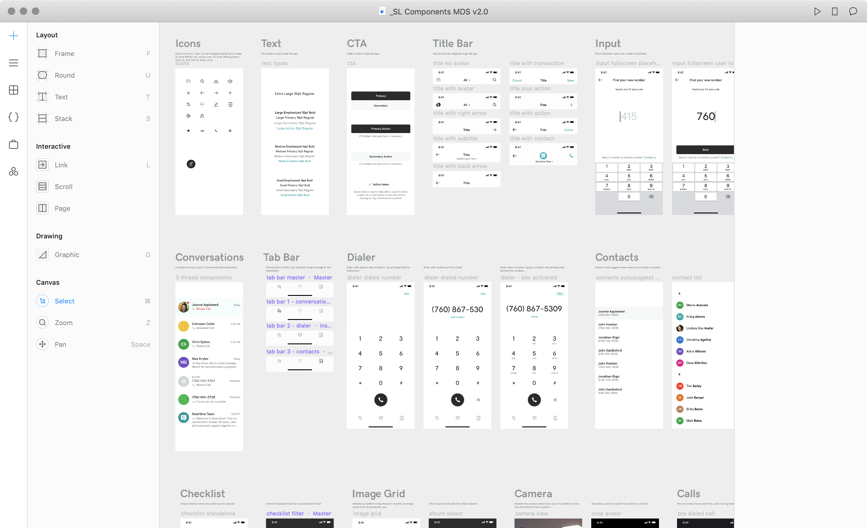 Framer is definitely in different category from the other tools mentioned. The others are created much more from the traditional designer's point of view, whereas Framer is definitely coming from an "actual product" perspective.
I've recently used Framer exclusively on a 4 month long project. Some of the concepts in Framer where hard for me to grasp at first, even as a seasoned designer who fancies himself as a quick tool adopter.
Learning that you can't hit ⌘ G to group objects is a bit of a mind-bender at first, but you'll learn eventually to hit ⌘ return to convert something into a new frame. The frames concept is definitely a different mental model to grok, but I've actually learned to love it near the end of the project.
The biggest downside for me using Framer has to be the speed and performance of the application. I simply didn't feel fast and efficient moving things around and making a mess with designs.
I feel much more free and unhindered during my exploration process with a tool like Figma or Sketch. Framer feels much more positioned as the tool to use when you're ready to build you actual UI that will go into production. This is great, but not for exploration when you want to iterate through 5 ideas as fast as possibly with an infinite canvas.
Another thing I do love about Framer is the ability to create one Frame with UI on top of another Frame connected as a content panel—think of a scrolling list beneath a title and tab bar. Previewing this type of content was really nice in Framer and I like the ability to separate different views like that.
The ability to add code to pieces of the UI is also incredibly powerful, but I simply don't know enough JavaScript syntax to know what's available. I'm a fairly capable front-end developer and don't have any issue banging out a CSS animation or following some good JS libraries documentation, but I felt like I was sitting on my hands in the code editor in Framer.
This could easily by my fault for not knowing more JavaScript, but as someone who's responsible for the architecture, the interface look and feel, and the animations, I simply didn't have time to dig deeply into all of the code possibilities within the app, so I went back to InVision Studio to create the detailed animations that I knew would be possible with code, I just wasn't ready to learn the new syntax for everything.
I'm ranting more on Framer in this post because it's the tool I'm coming fresh out of.
Conclusion
I'm honestly thrilled at this current moment to move out using Framer everyday for the last 4 months, and go back to another tool that is both incredibly fast and incredibly functional. Right now that tool for me is Figma.
Now, as I head into full-time production on Shift Nudge—an interface design course—I'll be working primarily in Figma, but exploring features in all of the other design tools mentioned here as well.
If you'd like to continue the design tool conversation, hit me up on Twitter. Happy designing my friends.