This is a response to Adam Silver's May 25, 2017 piece entitled Floating Labels Are Problematic.
As the guy who made the original design that the majority of the Float Label craze was based on, I feel somewhat obligated to share my perspective on the matter.
I need to preface this by saying, I've never met Adam, but have read some of his other articles and I really appreciate and admire his thoughtfulness of tiny details, like whether or not a button should have an arrow or a hand cursor.
Adam makes a lot of great points in his article and in certain contexts, I would agree.
I believe however, that it's important to call out some subtle absolute statements in the article and point out that they're actually relative based on design at large, rather than the individual pattern of a floating label.
I also want to hedge all of this by saying that I don't believe float labels should be used for every form ever made. If you don't think they add value to your form, don't use them. Ok?
If you've tested one way versus the other, use the higher performing method. Who doesn't want higher conversion rates?
But just remember, a form alone isn't going to boost conversion rates through the roof.
You have to create enough value and solve a big enough problem with your content so a user is actually motivated to use your form in the first place.
I myself have done no official float label split testing and can't confidently recommend the pattern over a standard label, based on pure research alone.
But I can say that I recently used float labels on my Intro to Icon Design course form and saw a conversion rate of over 30%. According to my quick research, that's 10 times higher than the average opt in form that generates only 3% conversions.
Would the conversion rates been higher had I not used float labels? My gut says "no", but I have no data to back that up.
Ok, with all of that out of the way, let's dig into my commentary.
The following numbered headlines and quotes below are taken straight from the article.
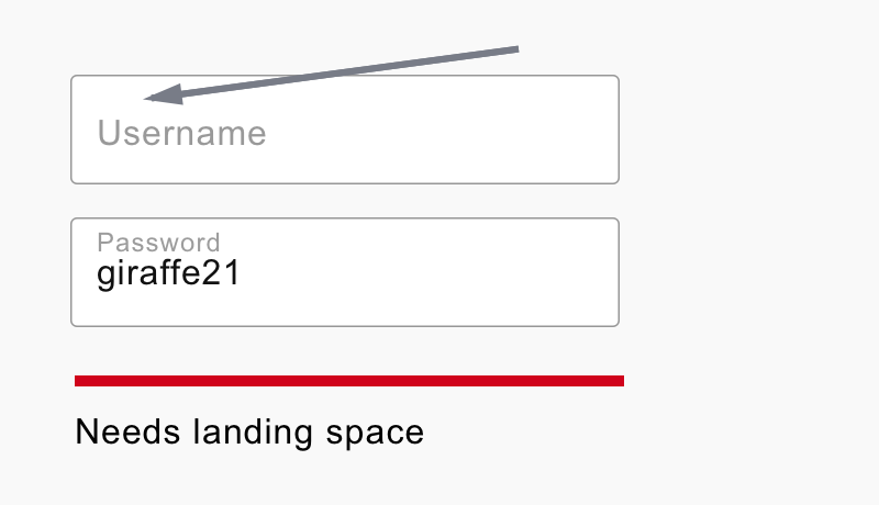
1. There is no space for a hint
The article states:
Floating labels start inside the text box leaving no space for an additional hint.
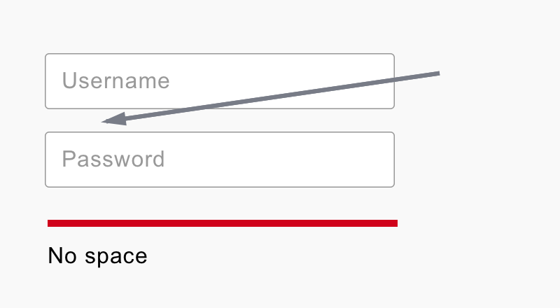
Ok, so if you intend to put a hint or a note above the input field and directly below the label, then yes, a float label will hinder your ability to do that.
However, If you really wanted a note or a hint, you could move it below the input field and simply push the other field down a bit.
Debating over hint placement is futile, unless you have an extremely clear picture of the exact problem trying to be solved with a form in the first place.
In some cases hints or labels are incredibly helpful and in other cases they are a bandaid on a poorly designed form. It simply can't be an absolute standard out of context.
2. They are hard-to-read
The article states:
Floating labels typically have small text, so that as it floats, it takes up a small amount of space. But small text is hard-to-read.
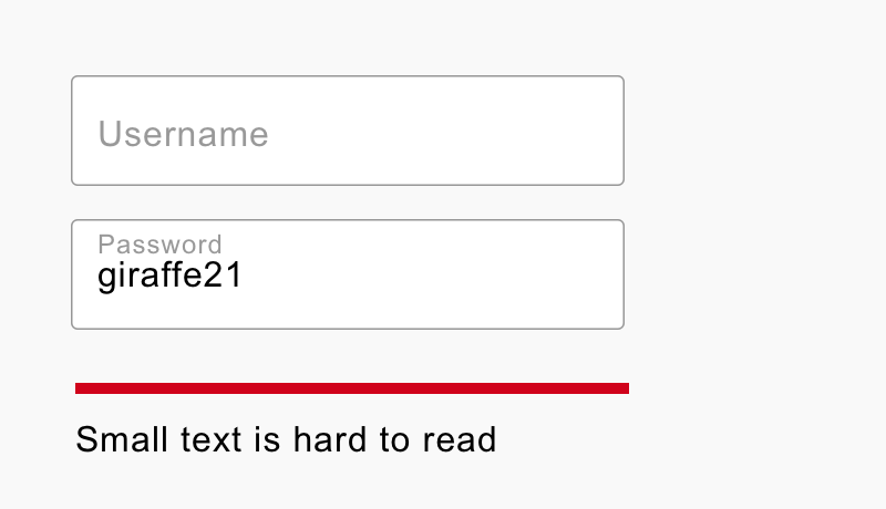
That really depends on the size of the text. And "hard to read" is a variable, not a constant, based on the user's eyesight.
Furthermore, text size is relative to a design in general—not float labels themselves. It's quite possible to have float labels be the same size as a standard label.
If text is displayed at a standard size of 16 – 18px, it's generally acceptable as readable. Perhaps more so than say a 12 – 14px size.
So let's agree for a moment that 18px is in fact easier to read than 12px...
Is it too unfathomable to assume that an easily read 16 – 18px, contextually scaled to a 12 – 14px after a user starts typing, would be suddenly too small to read?
I don't deny that 12px can be harder to read than 18px, but I see a float label as an artifact of the past, rather than a clue to the future.
It's a leftover indication rather than an instruction of what to do.
3. They need space to move into
The article states:
Floating labels needs space to move into. If label text is friendly (see previous point), there would be no saved space anyway — just more white space.
This is true, absolutely.
The float labels need space to move into and this is one of the trickiest problems to nail for the pattern.
Chris Coyier even wrote up his thoughts on this particular issue as well and concluded float labels don't save any vertical height at all.
BUT...
If you agree that the Float Label is an artifact, rather than an instruction, you might also agree that it's ok to go slightly smaller in text size than a standard label.
And with a smaller text size, say 12px instead of 16px, you would effectively save 4 or more pixels of space. Possibly even 8px since you wouldn't need to add extra margin below the label in the traditional sense.
We're really getting down into the weeds here, pixel-wise, but a great interface designer will be painfully aware of a 4px discrepancy and the affects it can have on the whole design if used properly or improperly.
So if you save 8px on 5 input fields in a form, you've saved a total of 40px. That's roughly the same height of a button on mobile screen.
Would that helpful for your project? I don't know. You, as the designer, will have to decide that for every use case you come across.
Let me give you a real world example of a giant complex form I worked on a few years back.
The project involved an insane amount of data for commercial shipping and transportation logistics. We were truly trying to make the complex, simple.
The forms below are screenshots of "work in progress" designs that I pulled up from the archive.
The left form uses a combination of top aligned labels and left aligned labels. We were experimenting—trying to land on the perfect solution.
Then, I designed the form on the right as an alternative to the shear amount of craziness going on in the form. We all agreed that it felt more clean, less overwhelming, and better overall.
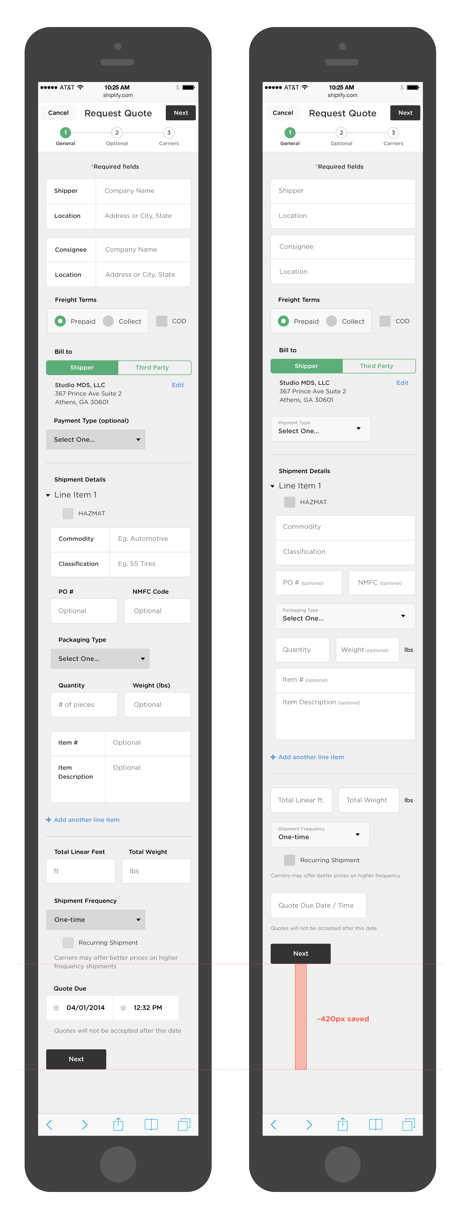
You can see that even though only half of the fields were top aligned it still resulted in over 420px of vertical height saved.
We even had a few impromptu tests where we asked people, "which of these forms looks less overwhelming?" And they agreed the form on the right seemed better.
I know this isn't 100% valid and statistically conclusive testing, but still, it's a start.
I would LOVE to get something like this properly tested one day, but until then it's an intuition, not a fact.
There are so many variables like content type, preexisting user knowledge, and more that make any single form test simply not 100% applicable for all future forms.
4. The animation is problematic
The article states:
Animation, even if it’s done well, could be distracting and disorientating, particularly for low confidence or visually impaired users. And, when zooming in, the label may disappear off screen.
Hang on a sec. If an animation is done well, then it is by definition "well," "good," "satisfactory," "to be desired," etc.
Therefore the phrase "distracting and disorienting" can't coexist with "done well."
I know that I'm incredibly biased, but when I fill out a form that really nails the Float Label animation, I get a teensy tiny little dopamine rush when the animation resolves and I move on to the next field. A small sense of completion that wasn't quite there before.
It's reminds me of a game where something visually happens in the wake of your character's path. Like a footprint.
I feel like I can't preface this enough, though. If float labels don't make sense for your project and adds too much unnecessary complexity, then please, by all means, don't use it.
I will still happily use your form if the other end of your form solves my problem.
5. They have poor contrast
The article states:
Like placeholder text, floating labels have low contrast to differentiate it but low contrast text is hard-to-read.
Depending on the design, when the label floats outside of the field, its colour will need to change. Otherwise the text will be lost against the background colour.
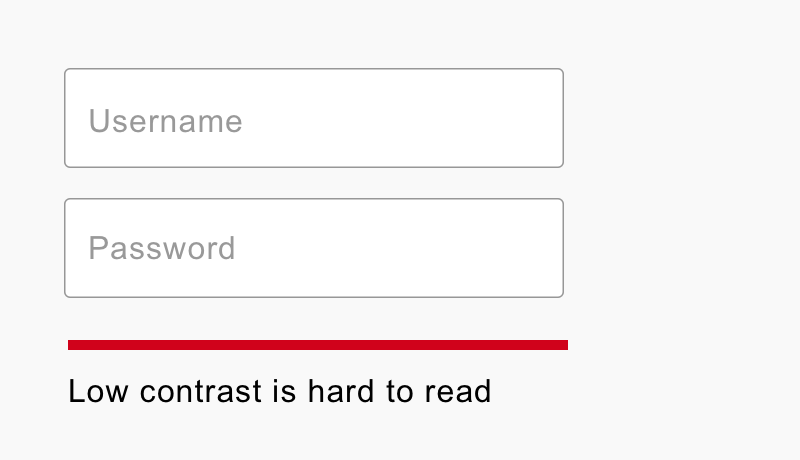
Low contrast has nothing to do with a float label and has everything to do with size and color.
The minimum WCAG 2.0 (Web Content Accessibility Guidelines) states that a color contrast ratio of 4.5:1 is necessary to pass AA guidelines for regular text size below 18~px.
The lightest grey color hex code that produces a passable AA contrast ratio is #767676 or #757777 on #ffffff (white) background. This is if you are using a regular font weight below 18px. If you're using a bold font weight at 14px size you can defer to the large contrast ratio the WCAG provides, which is 3.5:1 and ends up being #898989 on #ffffff. Side note: this is my favorite contrast checker.
Sidenote: I've designed projects for banks that require a minimum AA contrast rating for their digital product. I haven't personally come across a client that required more than AA, but we did set AAA as a goal (and hit it) when we designed Exxon's Unity Design System.
Ok, I've gotten waaaaaay off subject, but my point is that this is a color and design issue, not a float label issue.
6. They may be mistaken for a value
The article states:
People may skip the field thinking it’s completed already. When they submit, they will see an error which needs fixing. This is frustrating and time consuming.
This is a very valid point and also why color and hierarchy are of the utmost importance when designing interfaces.
Darker labels above empty input fields are pretty hard to mistake for something already in the field.
If you set a precedent for the user by having floating labels activate on user input AND the user input text color is much darker than the placeholder color—say #767676 versus #222222—then the possibility of confusion could be much lower.
I can't matter of factly say that this won't be an issue. I don't believe it would be in many cases, but making that assumption without hard data would be ignorant on my part.
Please design placeholders and labels wisely. If you're using proper contrast between placeholder color and user input color, this should solve any problems you might encounter.
7. They are inconsistently located
The article states:
Radio buttons, checkboxes and select boxes have static labels and legends. Where as text boxes have floating labels. This creates an inconsistent experience.
When looking at a text box, for example, the user has to look inside the control. For a select box they have to look outside of it.
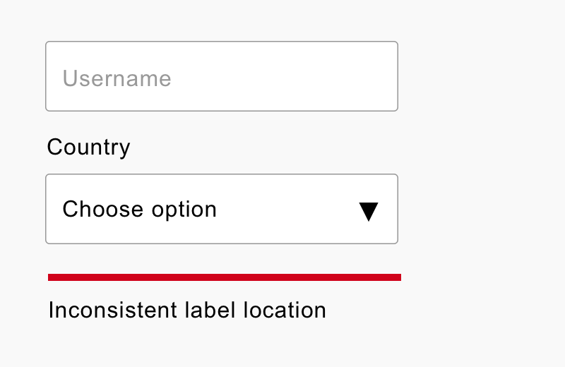
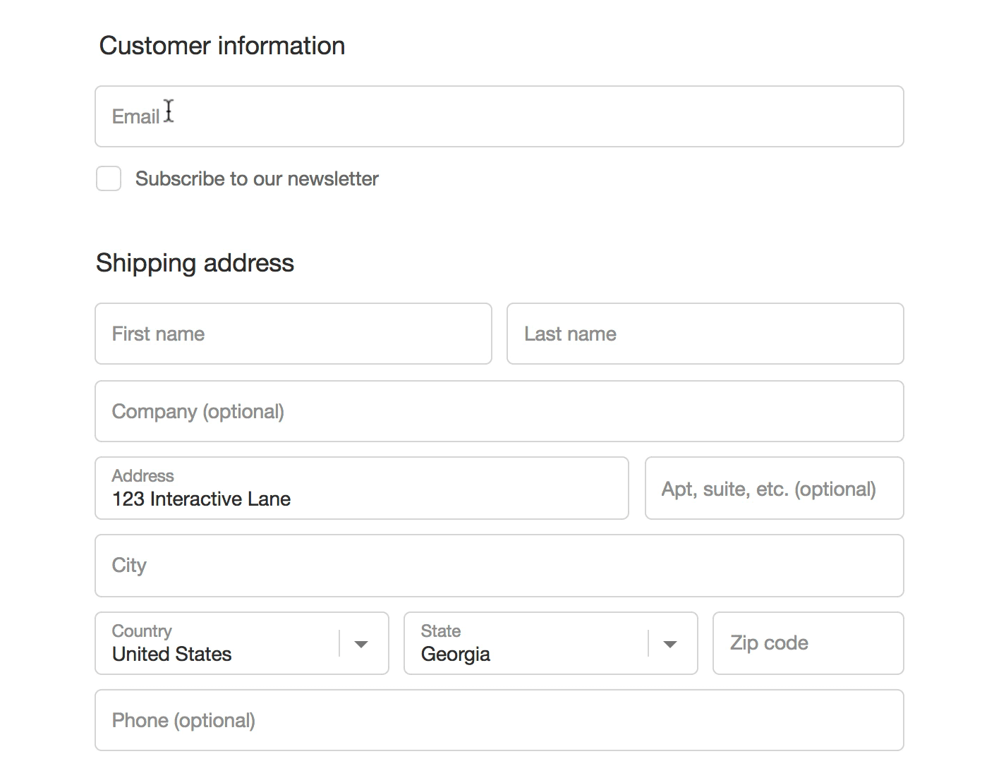
This is a design problem, not a float label problem. Shopify does an incredible job with the float label on their input fields and select boxes.
8. The label may get cropped
The article states:
If the floating label is longer than the size of the field, it will be cut off by the field. We should design for content, we shouldn’t make content fit the design.
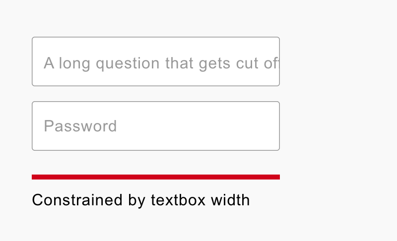
This isn't a float label issue per se, this is a bad form design issue.
No one should ever have a placeholder label that long.
And if you do truly need to ask a two line question as an input label, then I 100% recommend NOT using a float label.
It just doesn't make sense for that use case.
9. They ignore the standards
The article states:
We know placeholders are problematic anyway. However, if we’re going to put text inside a text box, it should be a hint, not a label.
This is the standard the article references. It reads:
The placeholder attribute represents a short hint (a word or short phrase) intended to aid the user with data entry. A hint could be a sample value or a brief description of the expected format.
Hmmm, "A word or a short phrase intended to aid the user" sounds like it could describe a label!
Now the standard documents also say:
The placeholder attribute should not be used as an alternative to a label.
I'm fully aware that there are circumstances that require an external label and additional placeholder data to really help out certain field input types. Sometimes you need to pull out all the stops when designing forms to really cover all the bases.
I agree 100% that no label and only placeholder data is a bad idea. That's why the float label exists!
The float label was created AFTER this standard was written. Is it not worth challenging original assumptions in old documents after new ideas arise? Especially ones that are getting adopted so quickly.
Is it reasonable to get curious about this rather than dismissive?
There's got to be some valid reason why Google adopted this pattern as a standard in Material Design Guidelines.
In addition to Google, the following companies have adopted float label patterns in their apps.
- Shopify
- Slack
- Digital Ocean
- Delta
- Invision
- Lots more...
Summary
The article states:
Forms are not a source of entertainment. The floating label won’t make users enjoy using forms. Users don’t care. They just want the outcome.
I just simply disagree. A user who is entertained is much more likely to remember their experience with your product.
I will add a caveat though that you shouldn't put entertainment above functionality and clarity.
There are better and more productive techniques for improving form design. Let’s spend time and energy on those instead.
I definitely agree with the first sentence and sometimes improving form design is removing fields or rethinking if a form is even necessary.
But shouldn't we spend time on ALL facets of form design improvement?
For more resources on the float label pattern see this post.
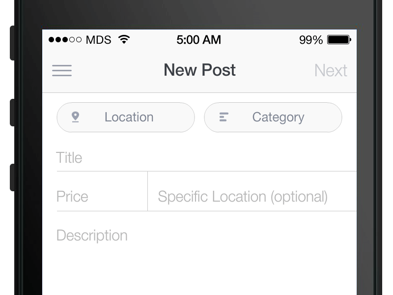
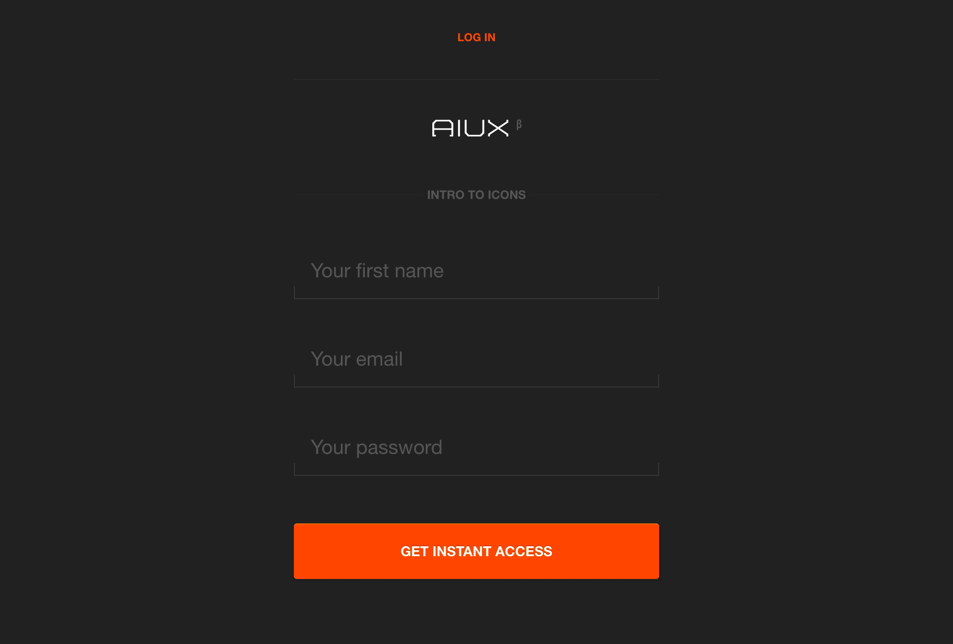
To try out a float label form for yourself, keep scrolling to MDS Mailer section at the bottom of this post.
This article is also on Medium if that's your thing. Fun fact, the Medium article has gotten 10x the traffic than my personal website. 🤷♂️