After writing a ton of content in preparation for my presentation at Squares conference, I ended up scrapping lots of it to keep my time below an hour and a half. Now that I've had some time to go back through and make some edits, I now present to you, the scraps.
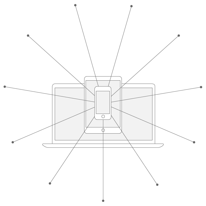
Making responsive websites is hard. Throw a bunch of opinionated people in the mix and it can seem nearly impossible. Let’s dig into what it takes to handle the pixels and the people really well. From beginning to end, we’ll walk through a solid, designer-focused process to make your next project a success.
These steps (the result of much thought and experience) are not meant to be exhaustive coverage on the much written about subject of Responsive Web Design, but rather suggestive in nature to inspire you to plan your work accordingly.
Though written through the lens of responsive design, the motivation behind these steps can be applied in some capacity to nearly all digital design endeavors that involve a designer and a stakeholder.
Here are the steps.
- The Pitch
- The Sale
- The Kickoff
- The Goals
- The Team
- The Deadlines
- The Discovery
- The Content
- The Design
- The Development
- The Deliverable
1. The Pitch
The pitch is fertile ground– fresh tilled soil if you will. You have the power to decide what type of work you want to do, how you want to do it, and who you want to do it with. Put on your game face and get prepared. Don’t wander into a meeting with stakeholders without being ready to handle virtually every question that could come up.
What’s your process? What should we do? What is your rate? How much will X cost? How long will X take?
Preparation is your upper hand. Use it wisely.
2. The Sale
The sale goes hand in hand with the pitch. If you weren’t prepared during your pitch, whether you sought out a client or they found you, you’ll be forced to conform to their process or lack thereof. If you don’t have a process or a plan, the client will set priorities instead of you. I’m not saying that clients shouldn’t set priorities, but rather their priorities should be tucked properly into your specifically and thoughtfully designed process.
3. The Kickoff
The contract is signed, you’ve got your deposit and everyone’s excited. This is you’re chance to officially reinforce what you’ve pitched and sold in addition to the flow of the project. Here you should cover the client’s business objectives and goals (eg. “We want to capture email leads for our current and future products.”), as well as the plan to accomplish those goals. You should cover the team involved and who will be responsible for what. Deadlines, Content, Design, Development, and Deliverables should all be covered here. Explain your process, in what way you’ll present your work, and how the client should give feedback, and at what time. Cover how you’ll incorporate feedback and at which points in the project will it be too late to give certain feedback (eg. Major design changes during launch is too late.)
4. The Goals
The goals of the project, drive the project. But even deeper than that, you need to excavate the why behind the goals. Sometimes the why is clear: “We want to sell our thing to make money.”
Other times it’s foggy: “We want to collect emails.” Lots of assumptions can be made about collecting emails but the idea behind goal setting is getting everyone on the same page about what will make the project a success. The less abstract the better. You need details. Lots and lots of details. If the client has already prescribed a solution to their problem, you need to interrogate the solution mercilessly. Poke holes in it. Challenge it. You need to make sure you’re solving the root issue and not just a side effect of a root issue.
5. The Team
Once at MailChimp headquarters, I sat in on a presentation by Michael Lopp, who worked at Apple for over 8 years. He talked about how Apple had DFRs (Directly Responsible For) on each team. These DFRs were directly responsible for a specific area of a project. If Steve Jobs thought, “Why are these animations screwed up on iOS?” He could go immediately to the DFR over animation.
Can you feel the weight of that?
In an Apple meeting somewhere:
Hey you!. Yes, you. You are directly responsible for all animations in iOS.*
If that’s you and the animations are laggy and janky in iOS, well, it’s your fault. You are to blame. If you’re a DFR and something’s not right, you’re on the hook.
We need DFRs on our projects too. It may feel slightly uncomfortable at first to link your name and everyone else’s name with a specific item, but that’s what needs to be done. Extreme accountability.
Who’s doing what. We need specifics here too. From your side and the client’s side. You need to know who will be your main contact. Are they answering to others or do they have final authority to approve decisions? If they have a boss who will make final decisions, you need to know that too. Ideally, you could have access to that boss, and involve that person in the conversations surrounding the details of the project.
Who’s in charge of the content? Who has final say over the button labels? Own it. There’s an old saying that goes “Measure twice. Cut once.”
6. The Deadlines
Again. Get specific. No vague answers like “early 2015” or sometime in the next few weeks. Nail it down. Set a date. Make it real. This puts the necessary pressure on everyone involved to get their stuff done on time. This is especially crucial when dependencies exist between team members. For example, “We can’t launch the website until the copy is final.” Great, who’s in charge of the copy? When will they have it done? Is anyone going to review it? Who? When? Make sure there are deadlines for the work that needs to be done.
There are some common responsive web design project deadlines, including but not limited to:
Client - Written content for each section - Written feedback on key design items - Any business or operational task (retrieving API keys, credentials, etc.) - Etc.
Consulting Company (You!) - Initial wireframe review (if you’re even doing wireframes) - Initial UI maps or visual exploration (style tiles, element collage, etc.) - Initial development build. This can be rough, it’s ok if it doesn’t match initial visual designs just yet, the client needs to start seeing things in a browser, because that’s when it becomes real. - Content reviews (if you’re helping with the content) - Subsequent reviews of the previously listed items - Etc.
Set deadlines for everything, not just the pie in the sky launch date. Oh and while I’m at it, when has anyone ever launched anything in one day. We need to start thinking of launch week or launch month instead. I’ve never launched one thing that I didn’t immediately need to tweak once it was live, which is another big reason to get the site into the browser as soon as possible.
Equally important, make sure everyone knows about and agrees to the deadlines. It’s easy to vaguely set deadlines and assume everyone will follow them, but it’s more difficult upfront to explicitly express and gather unanimous sign off on each deadline. This one act alone can work wonders for the flow of the project. No client colleague can swoop and poop on the designs right before the project goes live and demand changes if the person directly responsible for the sign off has indeed signed off.
7. The Discovery
We’re pirates on a treasure hunt here and should have a nice map to use based on the previous steps. During this block of time dedicated to research and discovery, we’ll familiarize ourselves with the material. This is when we need to transform ourselves into a Sponge Bob and soak as much information as possible.
Are we working on a redesign or starting from scratch? There should be a lot of back and forth with you and the client during this time. Ask, ask, ask, ask, ask. Don’t assume too much during this period. Clarify objectives for the site. Find other sites or applications that do similar things and study them. Soak up as much information as possible, including but not limited to:
Define what you’re trying to do here and ask the most important question– why are we trying to do it? Don’t settle for an answer like, “We’re trying to make a responsive website, because the client is paying me to.” Challenge yourself and the client to uncover the core essence of the digital exercise. Are you selling something? Do you want to collect email addresses? Do you want people to use your app?
Study competitors.
- Ask lots of questions.
- Study the sites that the client has told you she likes. Ask why she likes them. Determine if the examples are relevant or not, discuss with your client.
- Ask lots of questions.
- Pull inspiration from other places– colors, UI patterns, color schemes, screenshots of sites and apps.
- Comb through existing content provided by the client.
- Clearly define a desired course of action for a would-be user on the new site.
- Ask lots of questions.
- As the designer, you are the human advocate– a liaison for the users. Put yourself in their shoes to understand their wants, their needs, and their desires so you don’t have a one-sided view of the project as a whole.
- Talk to existing users that fit your project’s target market. Conduct research no matter how informal.
8. The Content
Examine closely what exists and what doesn’t and see how it all fits together. Perhaps you’re redesigning an e-commerce site, so you examine the retailer’s product line-up, the categorization of goods, the hierarchy, and start plotting these things like pieces of a puzzle. Are there duplicated batches of information? Could their be a clearer presentation format? Does the content seem confusing as it exists or could items be moved around to be made more simple.
Some people like to use sticky notes and have everything up on a wall, which works great for group sessions, but if you’re like me you may want to make a good old fashioned ordered list in a word document. You can do this by examining existing content, by working with the client to determine future content, or in some cases a combination of both.
The Content is the most important piece of our digital puzzle. The proverbial meat to the bones. You can think of the content like a human’s muscles. If the content is strong and well defined, the appeal to users will be as well. If the content is weak and lacking, it won’t be able to perform well and won’t be able to command much attention.
When I first got started in web design, I put very little thought into the content. My designs were art and I was serving myself. Overtime I realized that my designs are merely an empty vessel to serve up knowledge and information to the Almighty User. Yes they’ll have a certain flavor, but the designs are ultimately a tool for serving (and persuading).
An experience will fall flat when the content is an afterthought. Early on in the kickoff as well as during research and discovery phase, talk about the content with your client. Devise a game plan for who’s directly responsible for the content and how it will be implemented.
9. The Design
I typically divide a project’s design phase into two sections, depending on the scope and team dynamic:
- (UX) User Experience or (IA) Information Architecture
- (UI) User Interface
These two sections are unique and individualistic, yet dependent and intertwined around each other. But alone they can’t do much without considering the content and the code. All of these pieces work together in concert much like a human body in the real world.
In Frank Chimero’s article, The Web’s Grain, he eloquently states:
“Everything is so interconnected that nobody has a clear domain of work any longer— the walls are gone, so we’re left to learn how to collaborate in the spaces where things connect.”
Interconnectedness is the name of the game. We can no longer treat design, development, etc. as completely separate things. They’re all dependent on each other. Consider the human body, how the skeleton provides a framework and structure for the muscles to wrap around. The skin, hair, eyes, etc. provides the visual layer for all that lies beneath. And the organs (brain, heart, lungs, etc.) brings everything to life. It’s all interconnected and dependent. Likewise with our websites.
The UX, Our Skeletal Architecture
If the skeleton provides structure for our bodies, so does the IA for our websites. If something is broken, it’s painful. If we can sign up for a newsletter but can’t ever seem to unsubscribe, that’s broken. If we try to order some food from a local restaurant’s website and keep getting a PDF, that’s broken.
Structure is important for our bodies and our websites. The smallest fracture can cause unbearable pain. In contrast, a healthy skeletal system is appropriately crafted to provide a solid structure for the rest of the body to balance. The muscles, organs, and everything in between are tucked within the skeleton. Similarly our content, visual designs, and even lines of code are nestled into place in accordance with the site’s IA. Sorting out the structure of your site in some form or fashion is incredibly important.
The Muscular Content
The content serves as the muscular structure for your project. If the content is strong and well-defined your project will have plenty of substance to maintain active visitors, who can ultimately be persuaded to take action based on a set of business objectives. Think of Apple. Visit their site to check out the MacBook Pros and every detail is covered about the capabilities, the manufacturing process, the thought that went into the design, not to mention the software that comes pre-installed. You could spend hours combing through all of the content. It’s well-defined, sculpted, and attractive, not unlike the physique of a professional athlete with his or her fit body capable of great feats of strength and skill.
On the other hand, it would be easy for Apple to completely bombard their website users with a barrage of information overload, but they elegantly layer the information in a well-structured format– served appropriately in bite-sized chunks. The content is properly placed and well-rounded, not like the guy at the gym who only does curls and has freakishly large biceps that overshadow the rest of his body.
The UI, Our Visual Interface
When we meet another person for the first time, we literally interface with that person. Interface is defined as “a point where two systems, subjects, organizations, etc., meet and interact.” When we shake hands with someone, we feel the strength of their grip, look into their eyes, notice details about their face, hair and skin. We make judgements instantaneously. We decide quickly how we feel about that person. Was our interaction fluid? Awkward? Fun? Average? Was the person impressive? Did they seem prideful and arrogant or meek and humble? Were they genuinely interested in you or were they only self-seeking?
We can ask the same questions about an interface design. The interface is the single point of contact between humans and machines, but the interface itself is not a self-contained object. It’s deeply connected to the content and the structure of the site. Like skin grafted to muscle, wrapping around bones, the interface is the presentation layer for all of the thought, effort, and work that was poured out into the creation of the system as a whole.
It’s impossible to design an effective interface without the context of the structure and the content. If these core pieces are missing, we’re in trouble. A frail skeleton with little muscle to hold up skin lacks sufficient content. It’s fragile and weak. Too much undefined content and we have bloat– a fluffy layer of insulation camouflaging the actual system of strength.
A strong skeleton with healthy muscles, healthy skin, well-kept and well-groomed, is ideal for the human body, and ideal for a website. Good structure, good content, and visually appealing features all working together harmoniously.
The Coded Organs
This makes everything tick. The brain, the heart, the lungs. Organs give life to our bodies and empower the necessary functions for survival, both voluntary and involuntary. To be as efficient as possible, our code powers the predetermined structure, content, and interface. Any lines of code written that do not directly affect the website are fluff– extraneous bits of data that simply create longer load times and rack up technical debt. Just like the structure, content, and appearance, the code should be succinct and necessary.
When designing, you need to have a strong opinion about each detail of your layout while respecting the constraints of front end development. Can your designs be easily reproduced in HTML/CSS or is there some heavy customization involved. Customization isn’t inherently bad, but you need to make sure that you’ve calculated that decision with the developer and you both agree that it’s necessary and not a poorly thought out design that relies on customization to cover the mistakes.
10. The Development
The majority of thoughts and articles on responsive design seem to focus primarily on this main area–development. Perhaps rightly so since this is, you know, what makes the actual thing work. But too much jargon and deep focus without a clear vision of the larger picture can alienate people who just aren’t there yet with their skills and understanding. So for this post’s sake, I’m covering this section from a strategic point of view, not a tactical one.
I am a designer. I identify myself as a designer even though I can write HTML/CSS, enjoy writing SASS, and (if the need arises) hack my way around in JavaScript. Heck, the first language I ever learned was Actionscript 2.0, back in the Flash era. But still, I’m a designer. It’s what I’m best at so I shy away from being directly responsible for the code base of an entire client project.
With all that being said, it’s really important to start the development of a website as early as possible in the process. Actually writing code. If you’re a “web designer” that doesn’t know how to code (or at the very least the principles of how HTML and CSS work), you need to be in conversation with the developer on the project as early and as often as you can during the design process. The developer can build an early core structure and help you make decisions that will improve the overall quality of the site.
Showing clients a coded version of their site in-progress, even if it’s blocky and un-styled will produce results above and beyond what static comps can do by themselves. As long as you’ve properly outlined your process during the kickoff and the client has a clear understanding of how design and development converge to form the final product.
11. The Deliverable
In the end you should be delivering a website, not a set of static comps. I’m guilty of this many times over and nearly every time it’s happened I’ve cringed when seeing the final product that was handed off by me and developed by some stranger. These are the projects where I only want to put my preciously designed comps in my portfolio without a link to the final coded bastardization of my beautiful art. I’m exaggerating, but it’s my own fault if this happens.
Seeing a project through to the end is hard work, and by the time the coded designs are up and running, you’re probably sick of looking at it all, only noticing the mistakes. But it’s crucial that you as the designer are involved in the deployment of the site, if (and it’s a big if) you care enough about the project to get your hands dirty in the eleventh hour. I hope you do. We’re all counting on you to make something great– so is your client.
In nearly every project I’ve been involved in, the seemingly best results are in the final 10% of CSS tweaks. The details. The polish. The painful back and forth of tweak after tweak, which at the time may seem trivial, but in the end provides a cleaner and more holistic experience for the end user, who may not notice the subtle details directly, but they will notice a site and a design that feels “clean” and fits together nicely. They may not know why and that’s precisely the point. You’ve done the hard work of pushing, finessing, crafting, and tweaking the final product, so the burden of connecting the dots and sorting information isn’t on the user. You’ve relieved them from that arduous task. You’ve designed a website.
Closing Thoughts
Every layer of separation between the design, development, content creation, and decision making, adds an unknown variable to the web design process. The more separation, the more variables. The more variables, the more time and effort each task will take.
Everyone’s brain works differently, so not all concepts will be understood the same way. A developer will tend to think of concepts in terms of how everything relates to the data under the hood, and what is and isn’t technically possible. A designer will tend to think of concepts in terms of the interface.
Everything is connected so make sure you spend lots of time in the gaps where things overlap. Take the process outlined above and make it your own. Your project will be different and may not need certain steps, but you can move forward with confidence and boldness having a plan of attack. Go forth and make websites!