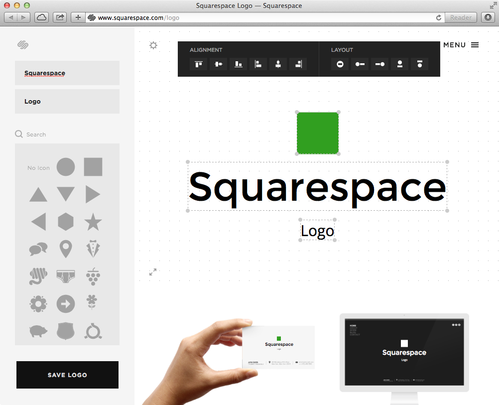
Yesterday Squarespace released a new product, Squarespace logo and my Twitter feed was blowing up about it. Some people were "extremely disappointed" and others "expected more from Squarespace."
Before I dive into the implications and interpretations of the site. Have you actually looked at it and played around with it? It's very well designed and works amazingly well. It's like an extremely watered down version of Adobe Illustrator in the browser. The design and user experience alone is impressive in my book and I applaud the team that put it together. Job well done.
I mean come on, there are actual people that worked on that thing day after day after day, designing, coding, tweaking, and on and on. To immediately poo poo on it the day it comes with a gut reaction based on your personal worldview is a bit trite.
The fact is, Squarespace makes off the shelf website templates for people to use. The quality is high and the service is quite nice. I've never deployed any website with it, but have tinkered around with it a few times. There are even a few really good designers that are using a prebuilt Squarespace template for their own site. Good for them, they look great.
I don't hear anyone complaining about that? Is there a fundamental problem with using an off the shelf website template? I say no. In fact the very site you are reading right now (at the time of this original post) is using the default theme for Ghost, called casper. And I'm a designer!? The travesty! How is selling a pre-made website template any different than selling a pre-made logo?
Now for some reason, if that same concept trickles over into "logo design" it becomes a big deal to lots of people. I can easily argue both sides of the coin. I can easily make fun of people who use Squarespace Logo, but what good does that do? What is the motive behind that? I don't need to do that in order to justify myself as a designer and neither should you. I believe that if you are truly and deeply bothered by Squarespace Logo, then perhaps you are threatened that there is a now a plug and play identity builder, which has the potential to render your services obsolete.
Were all web designers rendered obsolete when the advent of prebuilt themes came out? Is it now impossible to get a job in the field of web design. Poppycock. The thriving theme market just goes to show you how much of a demand there is in our industry.
When Crocs (I whiffed on my original analogy) Toms shoes came out it didn't take long for there to be a cheaper alternative called Bobs. Did this render Toms obsolete?*
No, it further validated the success they were having. But if you go into a store and test the materials, comfort and fit for yourself, you can tell the difference in the two products. Bobs feel cheaper than Toms, because they are. But for some people cost is the number one thing to be concerned about so they go for Bobs.
That's the same reason people use Squarespace themes, among others. It's not expensive, relative to a professional designer's services, and it's also very easy. There is a market for it. Not everyone can afford to pay thousands of dollars on a custom logo or website. As a matter of fact, I can't afford to hire myself to design a custom personal website. Mostly because I'm a horrible client. I don't know what I want, I change my mind often. So I choose a default Ghost theme for now, with a few minor modifications.
The same principals apply to Squarespace logo. There is a group of people that are starting businesses, products etc., that need something to get started. They have a budget of $100, $50, $25. 99% of the time I can't help people like that because I have my own set of needs that need to be met by charging clients my full market rate. Shall I tell these people to go make their own logo in Microsoft Word with Comic Sans, so all of my friends and I can make fun of them later? It's tempting, but that's not my style.
I would much rather see nice icons, designed by professional designers contributing to the noun project, used in the general public as opposed to another sad Papyrus logo with a swoosh through the middle.
*I literally have no idea why the Toms/Bobs comparison popped into my head. It's not a great analogy, so feel free to use your own metaphor here. Be creative!