Warning: Unsolicited hot take on a logo redesign.
Don't you just hate hot-takes without context and constraints of what the design team or designers were up against. Pushing vector points, presenting concepts, convincing stakeholders, etc... all of these are why hot-takes aren't very productive, yet here we are...
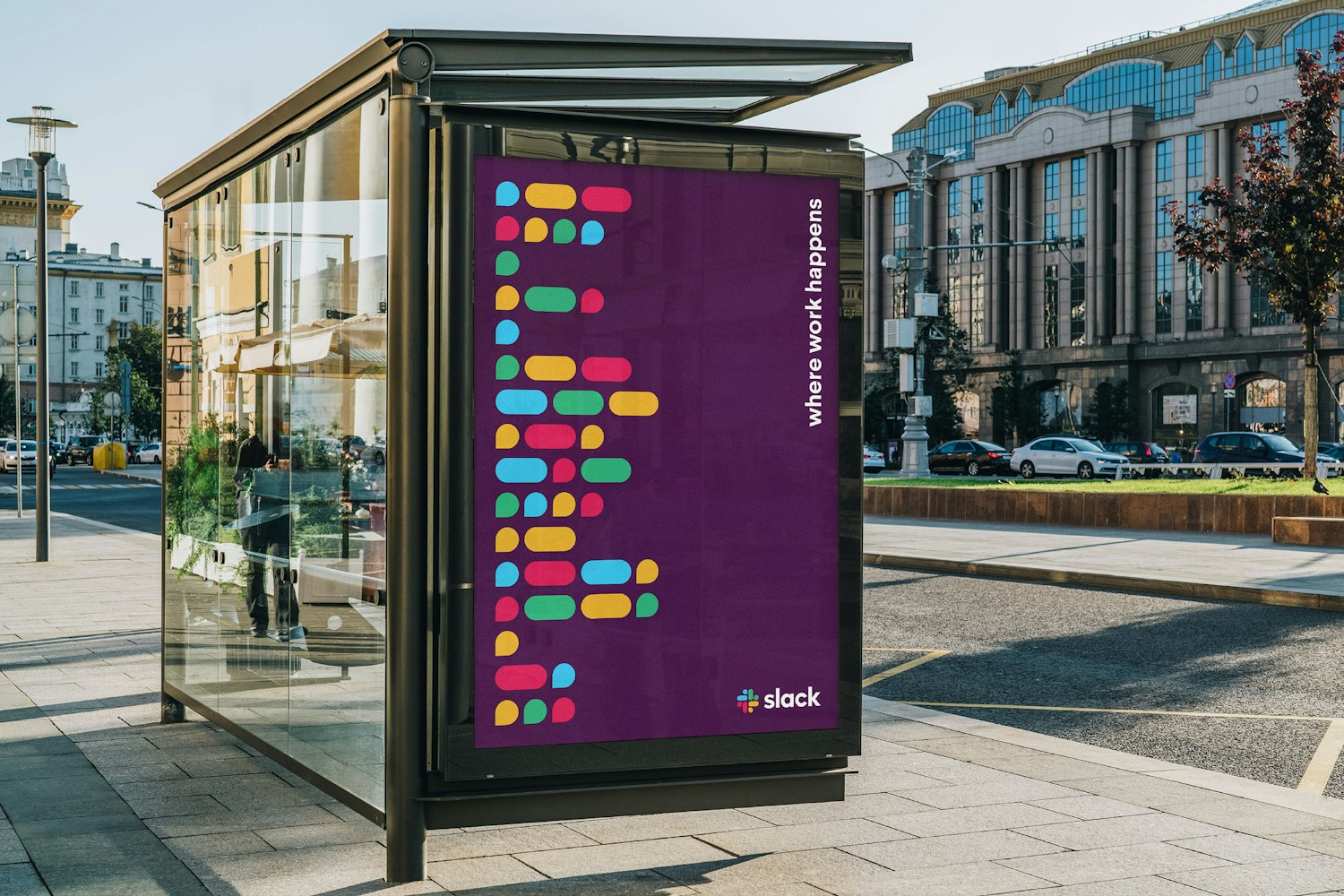
All in all, I totally dig the collateral and the patterns that have come out of Slack's logo update. All of the stuff on Pentagram's site looks really nice—the bus stop panel and the magazine layout, especially.
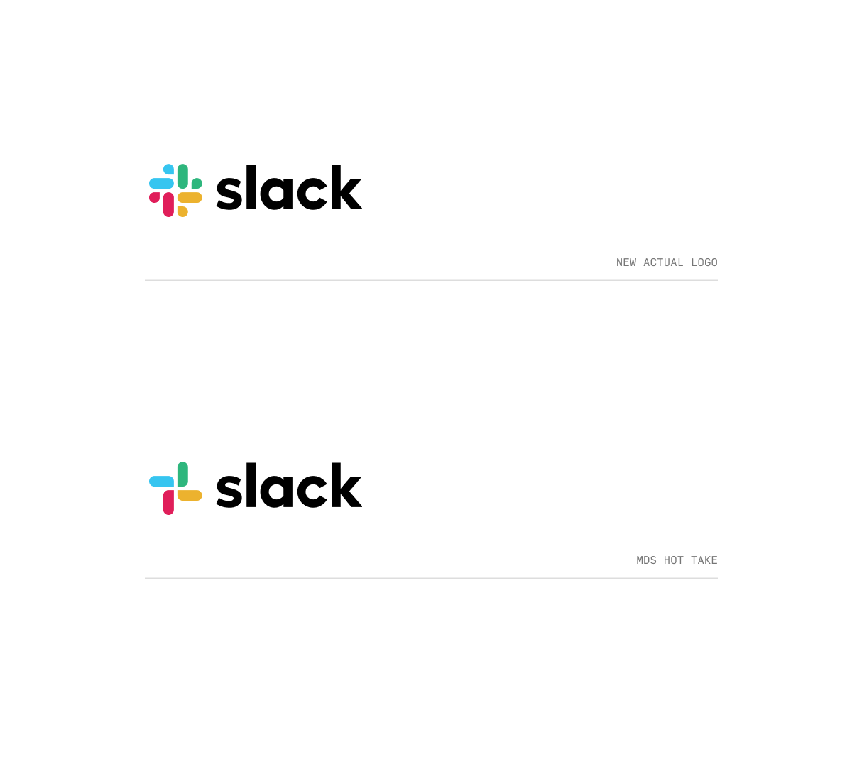
But the logo mark itself feels... too busy? I'm not sure yet. Maybe it's perfect. I've literally only seen it for a few minutes at this point. But I couldn't help myself. So I did this.
Perhaps it's the extra detail of the tiny speech bubbles?
Maybe I just miss the 4 bars?
Maybe there could even be a simpler version?
Anyways, props to the Pentagram, Michael Bierut, and the people making decisions at Slack. They're all way more informed and experienced on this matter than myself.
Bravo for making a change and putting it out there.