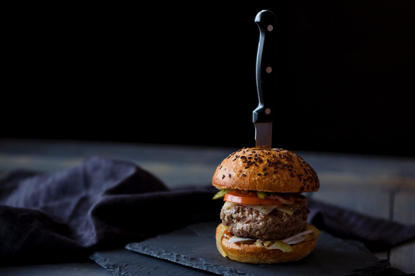
Why don't we, I don't know, talk to it for a while - see if he'll give us any information. It's obvious he knows something, so before we go all fire and brimstone on him, let's tie him to a chair first and do a little friendly Q & A. Rough him up? Sure, but he's more valuable to us alive.
I don't know about you, but to me it seems like the general population in the tech industry is kind of, sort of obsessed with murder.
"Kill the hamburger icon."
"This is the [insert very useful software here] killer."
"Finally putting [insert very useful software here] in its grave."
"[This useful software] is dead."
I get the idea behind statements like that, but letting it permeate every alternative option for software, menu icons, etc. seems a bit harsh, rushed, and quite honestly, dumb.
I'm glad that challenges exist and rise up, but not with such a dogmatic stance. It is important that there are serious advocates of the devil, who debate designs, add tension to taboo topics, and challenge the choices of designers and developers.
Being a devil's advocate is one thing, but completely dismissing and poopooing an idea is another. If we are to progress or advance with our design standards, our software - then we must be willing to try new things and have some healthy banter with opposing forces.
Let's not let phrases like "user engagement was much lower with the hamburger icon as the navigation" completely knock us off our idea horse, run to the nearest weapon and come back like a savage to kill anything unfamiliar like a treacherous enemy.
Question First, Kill Later
Here is a good one to get us started:
How important is the navigation for my project?
No matter the answer to the question, it is about one thing - your project. It doesn't automatically become gospel from the results of one user testing session or analytics read out that were unique to your project.
For the record, I've witnessed user testing for a huge national organization's new product rollout, and it was frightening how many assumptions were being made based on a tiny sampling of data from a single day (roughly 6 users) of testing.
Imagine this scenario. You have valuable content to show on the mobile rendition of your website. You've gone the extra mile to provide meaty content on the page. It's a delight to scroll through and read. Your content is legitimately being interacted with.
"But our analytics showed that user engagement was much lower with the navigation when it was a hamburger icon."
I can't think of a single website that has a goal of "clicking around in the navigation." If that is the primary concern, it may be possible that you are concerned with the wrong things.
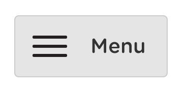
On the other hand, if test data shows that the duration of someone's visit is 1 minute with an average of 3 pages visited, with a completely exposed navigation that reads "Menu," but is reduced to 20 seconds with an average of 1 page visited after condensing the navigation into a hamburger icon, well then you have a little more to go on.
Even with the scenario above, more time on the site doesn't necessarily mean more engaged. It could mean more confused, especially if your primary objectives aren't being accomplished.
I just don't want us to get caught up in test data and interpret it the wrong way. I do believe reports that the majority of users don't know what the hamburger menu icon means. And yes, out of sight is out of mind. However, we need to remember that design is about putting focus on certain things and hiding others. Interface design is about the clever manipulation of objects for guiding humans to complete tasks. Let's keep those tasks in mind as we wade through our analytics. Let's hide some things and show others. Let's remember our purpose and not get too caught up in certain details if they are not crucial to our users' success.
Hamburger Options
We've now realized that the hamburger menu icon has digital gluten, and should be avoided like the plague. No. We've come to understand a few things about the hamburger icon, but we have not concluded that it is clearly and utterly useless.
My favorite example of a potential hamburger icon usage option, is that of an icon plus a label within a bounding box.
I believe it is crucial that we explore extremely condensed design patterns for mobile devices. This same thought process is what compelled me to design the float label form interaction, when a traditionally labeled form just didn't feel right.
If we completely abandon patterns like the hamburger menu icon, we will limit the progression of our interfaces by polluting our thinking. We'll get caught up in a "the world is flat" mentality, when in fact it is round. Very round. If we are so prompt to put down new patterns, new ideas, we may never throw things around on a screen like with cool gloves like Tom Cruise in the Minority Report. And dammit, I want to do that one day.
Save Icon
![]()
The floppy disk icon became known as the save icon because it made sense. People understood that if they wanted to write data to a disk to save it, they needed to slide their old school gigantic mouse over to that 8bit icon and click it. There was contextual relevance.
Guys, we need the hamburger icon, or at least something like it. We can use a hotdog for all I care, but please - let's let the idea live and breathe. Something useful will come of it, I'm sure.
If the need arises to hide a navigation on a mobile view of a website, we need options. If we show the word "Menu" beside the hamburger icon long enough, people will begin to associate the icon with a navigation menu. This is no different than Pavlov and his dogs.
The same way the canines began to salivate with the ringing of a bell, so shall we begin to associate "Menu" with the hamburger icon if it is used long enough. This puts it on the path to eventually being used as an icon only interface.
The save icon was used so much and for so long that people began to associate that icon with saving, even if there was no floppy disk to save to. It took on meaning. Now we've come full circle where the save icon is becoming meaningless as our kids (future bearers of the internet) have no context for a floppy disk. In fact, they barely have context for a click. Just yesterday, my 4 year old was trying to swipe through Netlix with his finger on my iMac.
The point is, things evolve - especially interfaces. It seems as if every designer and their brother fancy the hamburger icon, so let's not destroy this pattern and tell everyone to stop using it. Let's steward it. Let's set it up for success. Let's create smart guidelines for usage for the future. Perhaps, most importantly, let's keep an open mind for advances in the world of interfaces.
Challenge ideas? Yes.
Kill them quickly? No.