Contrast is a menu bar app that Sam Soffes and I launched. If you haven't seen it yet, definitely check out the site or the app before reading this post, otherwise it won't make much sense.
Sam was at working from my studio for a few days during a motorcycle trip of his across the Southeast.
It was rather serendipitous how we decided to make this app. We kind of just agreed to build after like 1 minute of talking about it. We grabbed dinner the first night he was in town and brainstormed some ideas. I brought my trusty pocket-sized Field Notes journal and pen.
We were at Ted's Most Best, a place in Athens you should totally go to if you're ever in town.
"Ok, here's what I'm thinking." I told Sam as I put pen to paper. I made a quick little sketch.
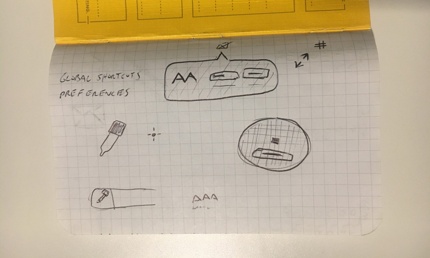
This is the one and only drawing I did of the concept. It's also basically the same thing I tweeted to Brent Jackson over a year ago when I asked if he'd considered making a menu bar app out of his Colorable demo.
After discussing with Sam, he felt confident he could get a rough prototype running pretty quickly.
We went back to the studio and within literally 15 minutes or so, he had the WCAG luminance equations and native color pickers working in a rough prototype app.
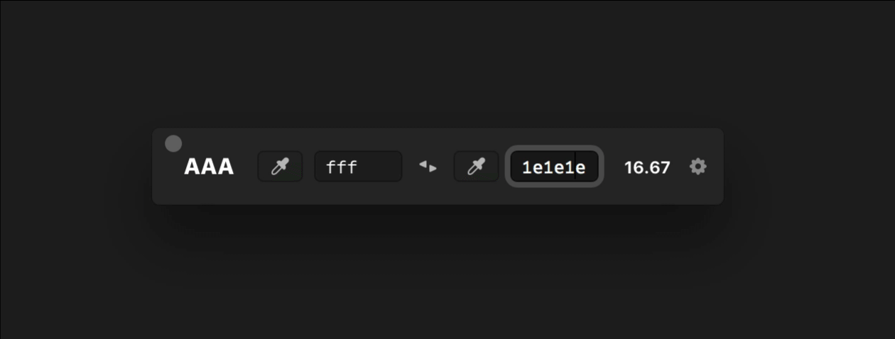
I don't have a screenshot of that, but it was basically the AA rating on the left with two default mac color pickers on the right.
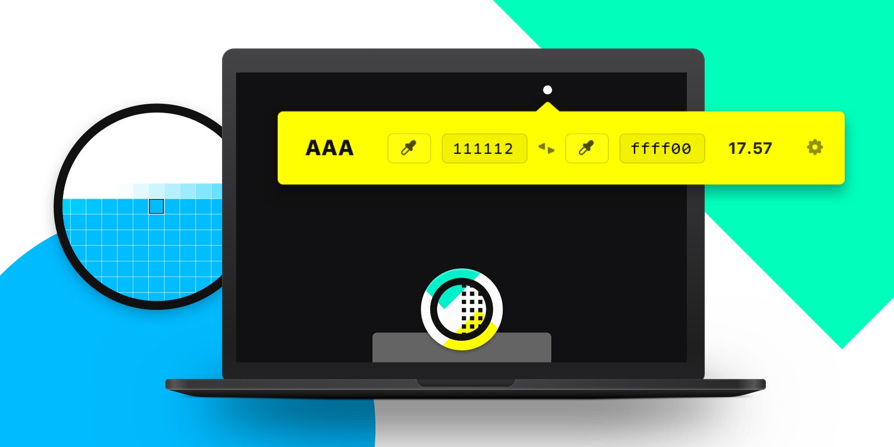
The Menu Bar Icon
I like to design interfaces based on moments in time—like the first time it's used versus how it will function with repeated use.
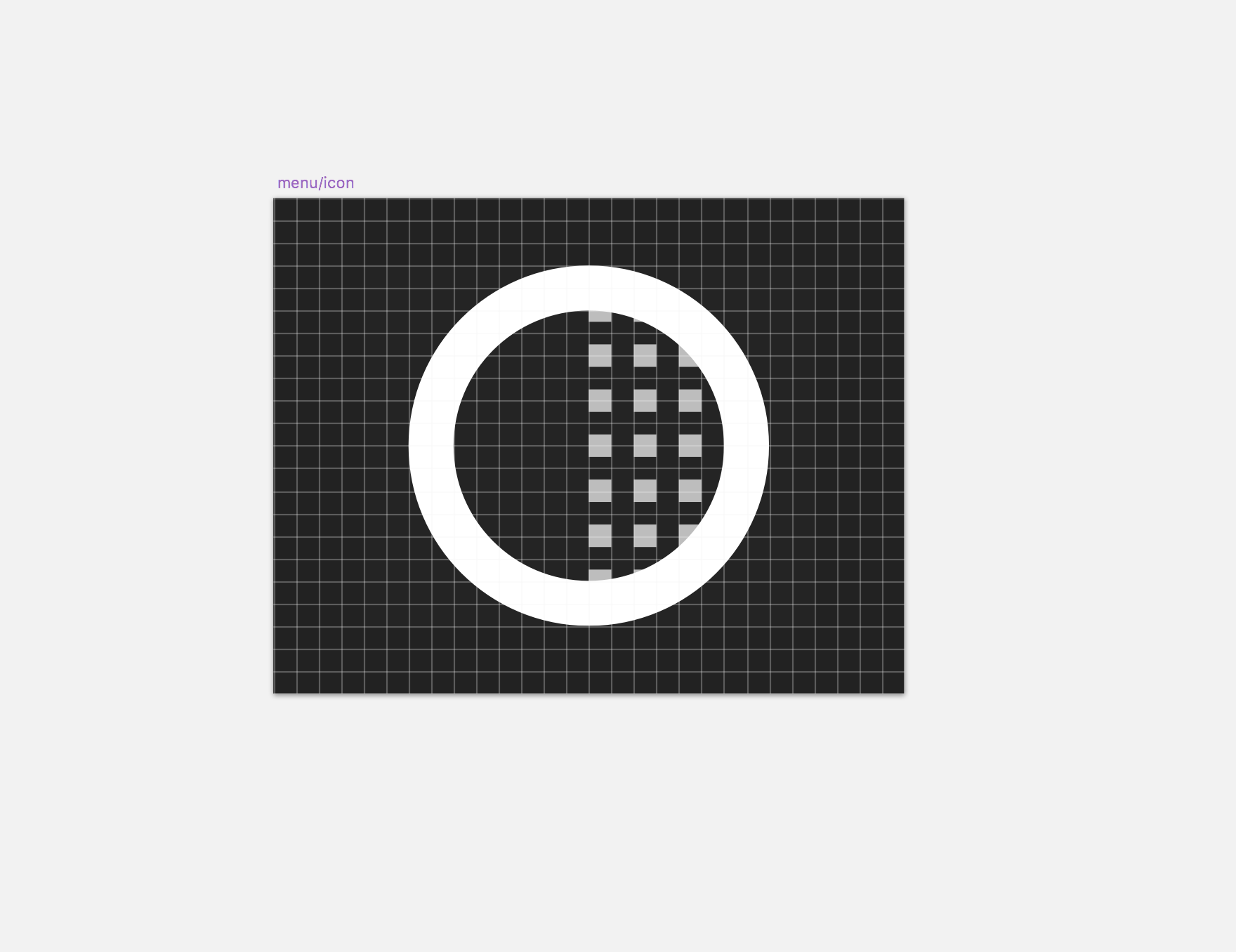
Because of this I started with the menu bar icon. The little 16px tall icon that you click on to show the app.
Here is the original design of the first icon.
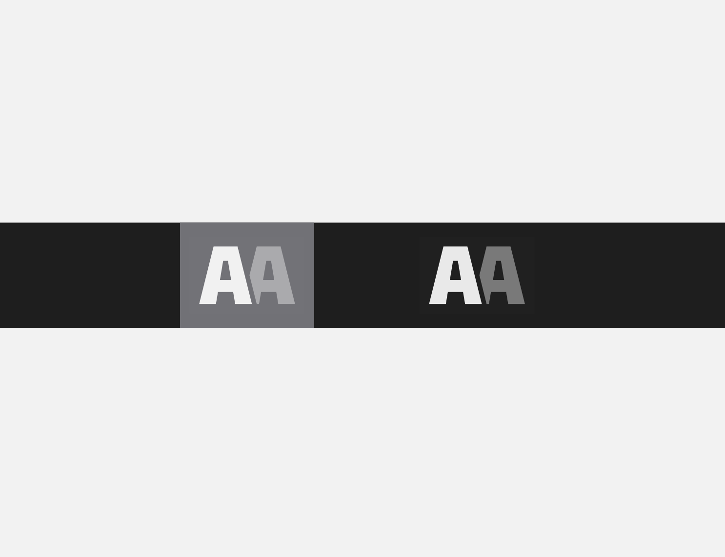
My original concept was an AA icon to represent the color contrast score. Typography by it's nature is typically designed anywhere from 1200pt to 2400pt, so it's not going to be pixel perfect when scaled down to a tiny size, which doesn't work well for a tiny icon.
I redrew the primitive shapes for the tiny As and had it looking pretty decent. Sam suggested trying a contrast-type icon like you would see when editing photos.
More concepts, especially at an early stage are never a bad idea. So I got started on the second concept. After a few minutes I came up with another concept (below).
Menu bar apps need 1x, 2x, and 3x menu bar icons.
I always find it easier to design for what you're designing on so I designed for 2x first, just at a 1x scale.
I designed the small squares on the right to start on a half Y pixel so the spacing would be more vertically even on retina screens. I adjusted to a whole pixel for 1x screens, and exported my half pixel version at 3x.
You can see the subtle half pixel in the spacing below.
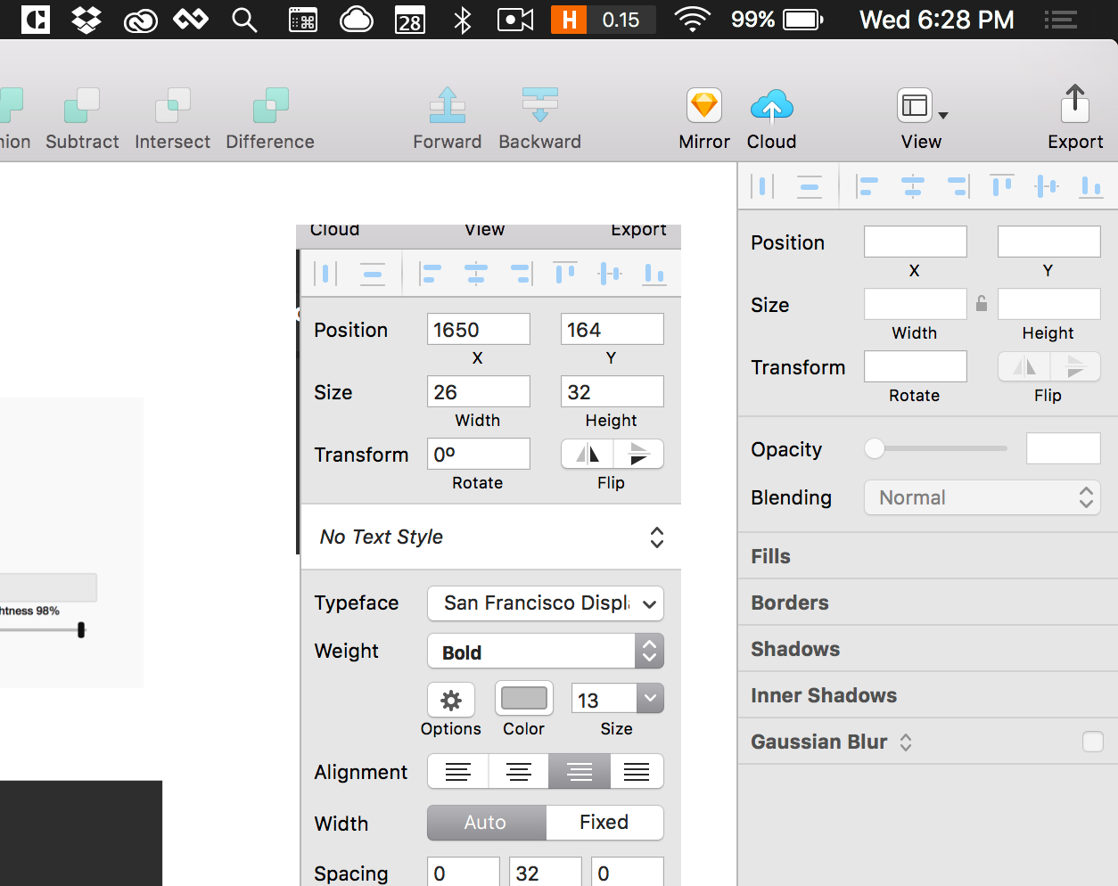
I went ahead and exported these for Sam to test in his prototype. I learned that the constraints for these icons aren't 16x16, they're more like 16xwhatever. You can have a custom width, so I decided to put a little padding on each side and settled on 16x20.
Somewhere along the way Sam needed to name the project inside of Xcode and asked for a name.
Without putting a ton of thought, we decided on simply Contrast since that was the most straightforward name of what we were designing for.
The App UI
Like any good drawing or painting, it helps to start with solid reference material.
Starting with Screenshots
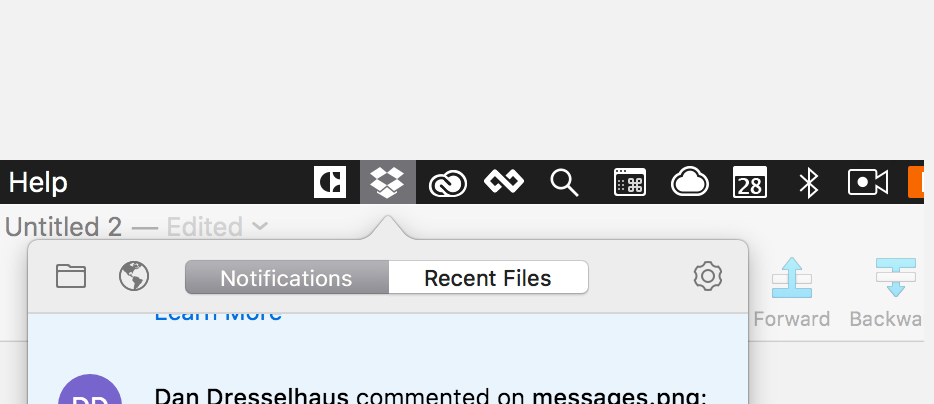
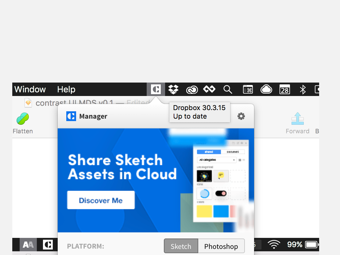
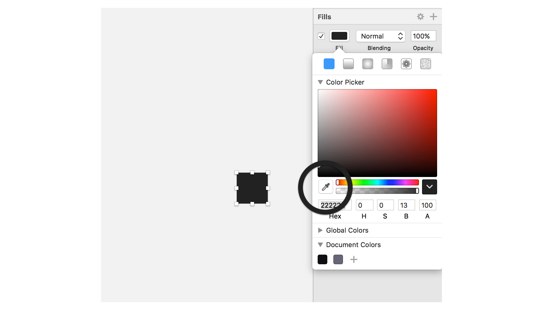
I took several screenshots of the the colorable demo, a handful of menu bar apps I use like Cloud app, Dropbox, etc. as well as a few screenshots of the menubar itself with Sketch open.
PRO TIP: ⌘ + option + shift + 4 is your best friend for tasks like these. Hitting that key combo changes your cursor to crosshairs that allows you to click and drag an area of your screen to make a cropped screenshot. This particular key combo saves the screenshot to your temporary memory instead of saving a file. You can then ⌘ + V the screenshot into your design application of choice.
I've only designed one other Mac app and the sizing can be tricky to get right if you haven't done it much before. 12 and 13pt fonts are way more prevalent on desktop apps as opposed to websites or mobile apps. It takes some mental convincing that it's OK to use fonts that size.
The screenshots are really helpful to use for sizing reference.
Initial designs
Contextual design is always best, so I designed the initial UI directly on top of the menu bar and Sketch screenshots.
I started off by designing pretty much exactly what I had sketched a few hours earlier.
There was a part of me that wanted to over design it with a really large AAA score with lots of negative space. That's what made me love Brent's version so much after all. But that just didn't feel right for a small utility. Websites and desktop applications are two different beasts and require different approaches.
You can see some of the quick initial designs below. They're super rough, but you gotta start somewhere.
I drew a background rectangle in Sketch and rounded the corners to 6 pixels. Then a used a smaller 20x20 square shape, rotated at 45deg for the small arrow on the top. I knew I'd want to change the color of the entire app background so I merged them as one shape.
Settling on style
I kept referencing input fields on different Mac apps. Sketch has very native-feeling input fields with square edges and that seemed like a good approach to begin with.
As I kept tinkering with the designs, nudging pixels here and there, the square input fields just felt harsh for the app. Perhaps it was the round corners of the background and the close proximity of the input fields to the soft edges.
So despite my initial attempts I went with rounded input corners instead. The entire UI would have to be built custom in Xcode anyway's so rounded or not, it didn't matter much.
App Typography
Unless you're building something extremely worthy of custom typography, you really wanna stick with the system fonts. In this case it's SF UI Display and SF UI Text.
Mac OS will automatically choose SF UI Display for type sizes 20px and higher and SF UI Text for everything smaller.
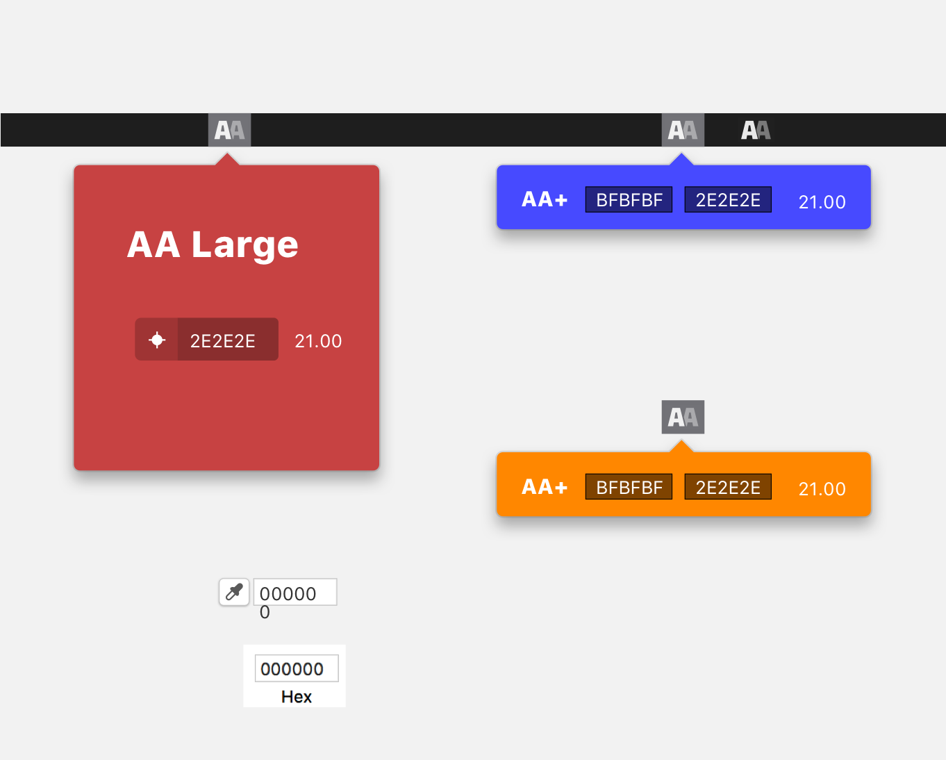
I originally used SF for all for type instances, the contrast score, the input fields, and the ratio.
In my designs I was simply using 000000 as the hex code place holder, but after a few test using variations on the hex code it was obvious that the character widths between something like ffffff was going to be much narrower.
Because of this I opted for a monospace font to keep the six character widths all the same. I went with my friend Mattox's font called, Native, which you can get here for free.
Nothing groundbreaking, obviously, since most people use a monospace font for coding, but something I had to discover in a roundabout kinda way.
Interface Icons
I had already created the menu bar icon, but now I needed one really good icon for the color picker.
My initial thought was a target or a crosshair type icon. You can see a version of that below.
But this just didn't seem right. I liked the concept at first, but it's so engrained in me as a designer that the eyedropper icon is what you click to summon a color picker.
So I took yet another screenshot of Sketch to analyze its color picker icon. I can't recall ever designing a color picker icon like this.
My process for designing icons is always to break down an object into basic geometric shapes when possible. I used 3 rectangles as the base shapes and adjusted from there.
For whatever reason, this particular icon was much trickier to produce than I originally anticipated. Getting the length and width of the tube just right will still falling on whole pixels was perhaps the biggest challenge.
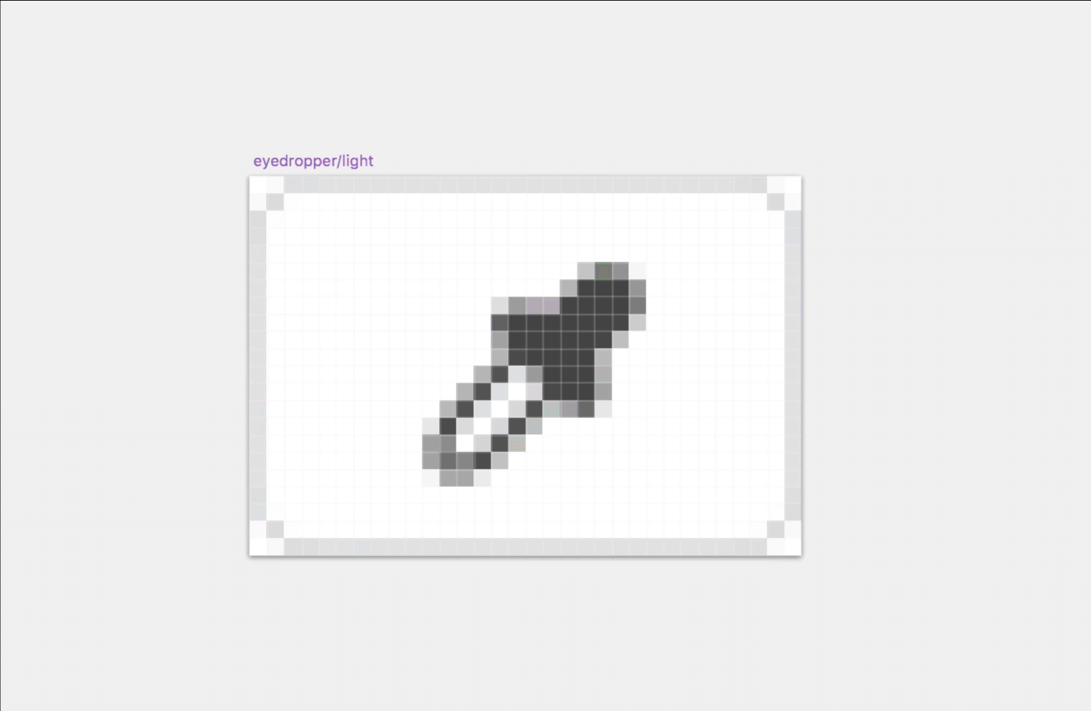
Once I had everything feeling proportional on the eyedropper I put it into a folder and rotated it 45deg. It's always much easier to create icons like this with no rotation and then rotate it once it's ready.
Then if you ever need to adjust the shapes, un-rotate, adjust, then re-rotate. This helps keep the shapes on whole pixels while you tweak it.
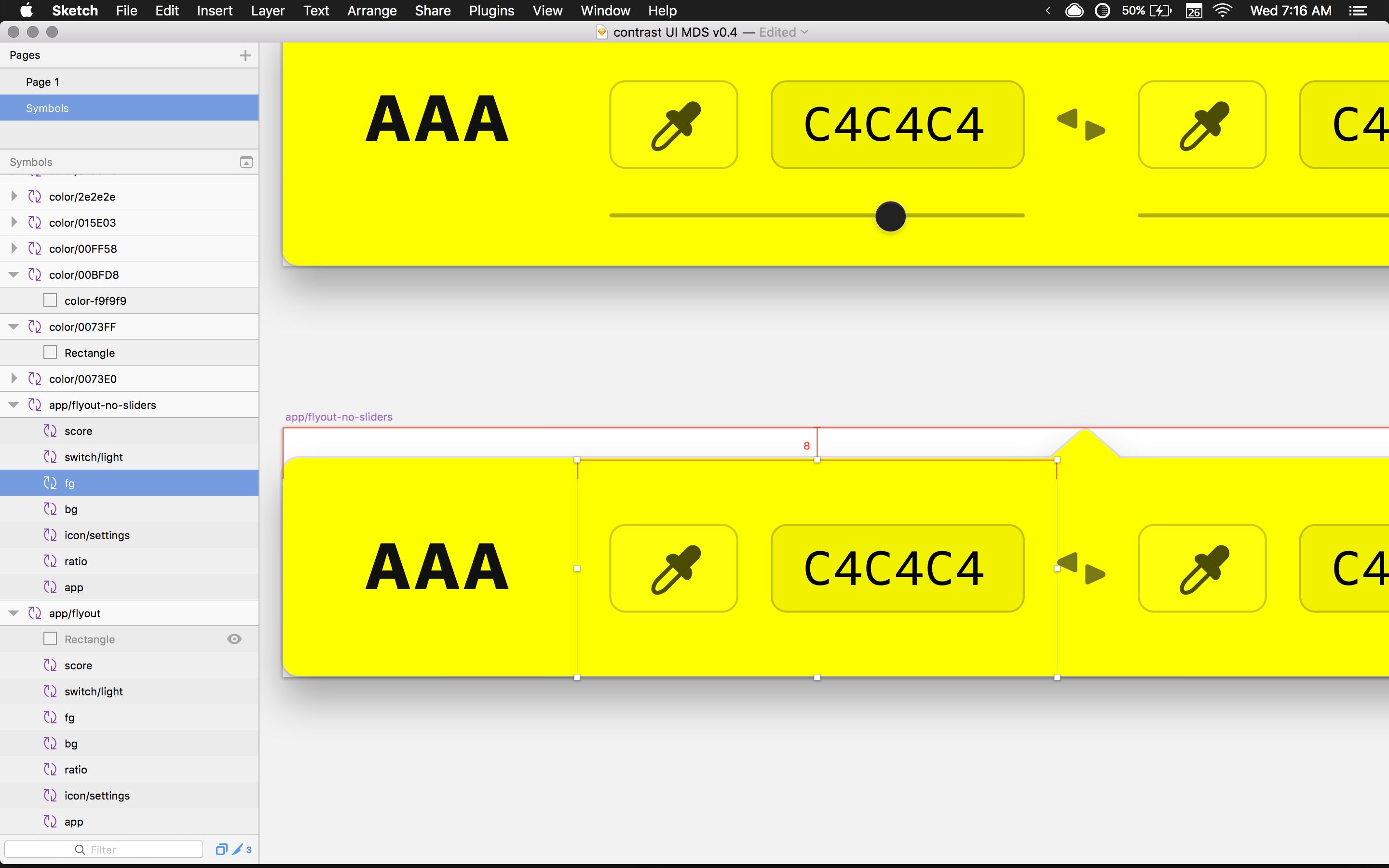
Dynamic color system with symbols
Now that my basic UI ingredients were coming together I needed to organize my components with dynamic symbols.
We planned for the entire background of the little app to change colors, when picking the background color. Because of this I needed to have at least 2 variations of the UI—dark and light—to account for the range of brightness possibilities. Think full black background or full white background.
The easiest way to manage these variations is with symbols. This would allow me to create multiple versions of the app with different background colors while using the same UI symbols for every instance.
I never like to start off using symbols because I find it to be too constrictive and hindering to the creative process. Symbols are better for production as opposed to creation, at least when starting off.
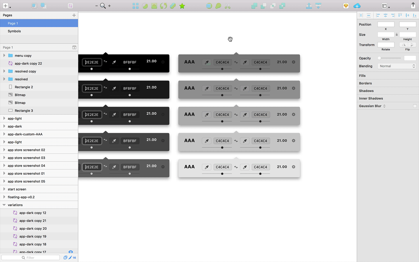
I wanted all of the components of the UI to butt against one another so it would be easy to re-assemble once everything was a component.
I temporarily removed the arrow from the background of the app so I could measure directly against the large background shape using the option key. Otherwise the measurements would extend all the way to the tip of the arrow.
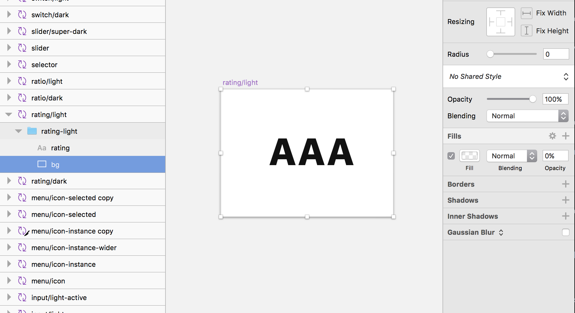
Behind each section of the UI, I drew a background shape and set the fill to 0%.
PRO TIP: Using a
0%fill will allow you to easily select the shape with a click, whereas removing the fill completely will make you're life more difficult.
After drawing the background shapes, I ended up with something like this.
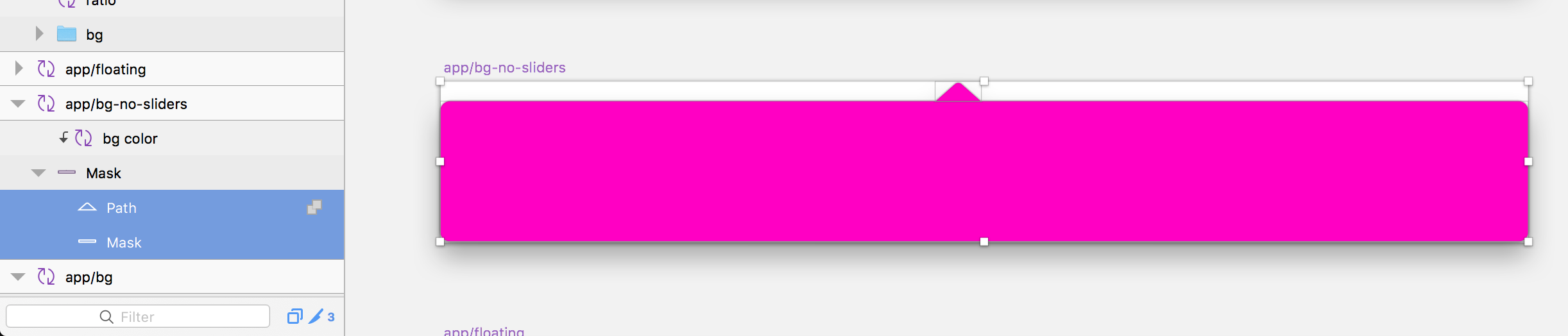
I also created a symbol for the background of the app, which included the rectangular vector shape and the arrow at the top as one shape.
Anything part inside of a symbol that needs to be changed dynamically, with the exception of text, needs to be a nested symbol.
So in order to have the background color be dynamic, I created a square color swatch of the same color and made a symbol out of that.
PRO TIP: Make sure any symbol you want to dynamically change has the same artboard size. If it's not the same size, it won't show up as a suitable replacement
Then I placed the color swatch symbol inside of the app background symbol and masked it with the background shape.

Side note: This is the same type of technique I used to do with Photoshop way back in the day with smart object color swatches.
Symbol Instances
You can see below that I now have a library of all of my symbols and their variations.
There are active states for both dark and light variations of the input fields for testing purposes. Plus, it's nice to have the flexibility of entering custom HEX codes for later usage in the marketing site design, App Store screenshots, etc. More on that later.
I've recently started using this amazing symbol organizer plugin aptly named Symbol Organizer, by Jason Burns. It does away with that never ending row of symbols inside of Sketch.
This has always been kind of painful to deal with as my symbol collection grew. The plugin, along with a specific naming syntax, completely solves this problem.
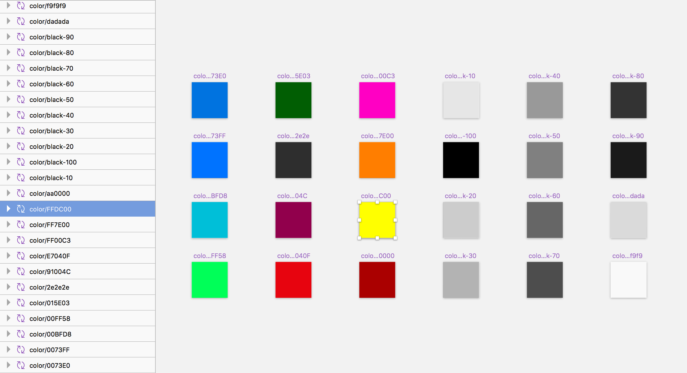
For example, you can group symbols by having a parent name, backslash, then an instance name. So for the background color swatches I used color/000000 and so on. The symbol organizer will group symbols based on the parent name to the left of the /. Life changing. =)
I encourage you to do what works for you though, and not get too caught up on exact naming conventions.
Symbol Assembly
OK, now that everything was built out, it was time to reassemble the app using symbols.
I use the Runner plugin to quickly insert symbols into my document. So any time I want to insert a symbol I can hit the quick key ⌘ + ', tab to insert, type the symbol name, and hit return.
I did this for every component including the background, the score, the foreground and background controls, and finally the ratio.
Now that I had the full app built with symbols, I selected everything and created another symbol out of all of the parts.
This gives me the ability to spawn a new version of the app all over the document. It's also really easy to copy and paste this one symbol into other documents as needed.
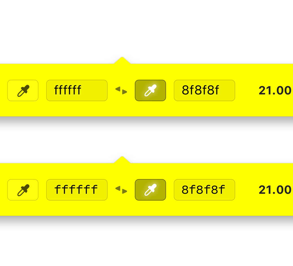
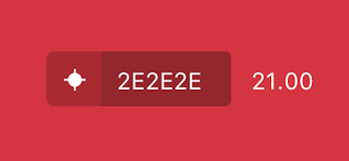
Testing for Background Color Variation
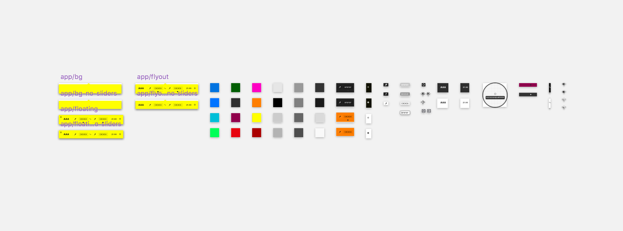
With my one symbol to rule them all built, it was time to layout a bunch of variations for stress testing the UI colors.
We planned to have a luminance if statement that would change the UI from dark to light based on the brightness value of the chosen background color. So I needed to make sure the UI wasn't going to break at any given range.
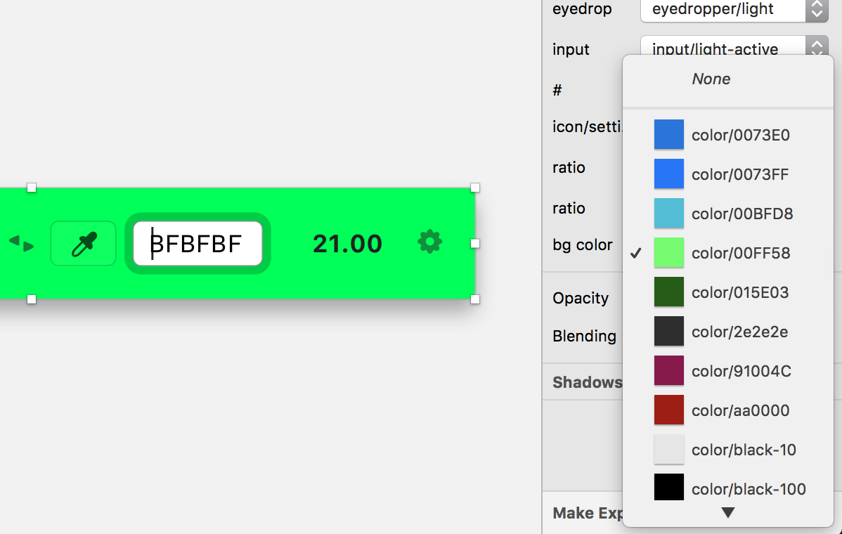
I laid out roughly 12 instances of my app/flyout symbol.
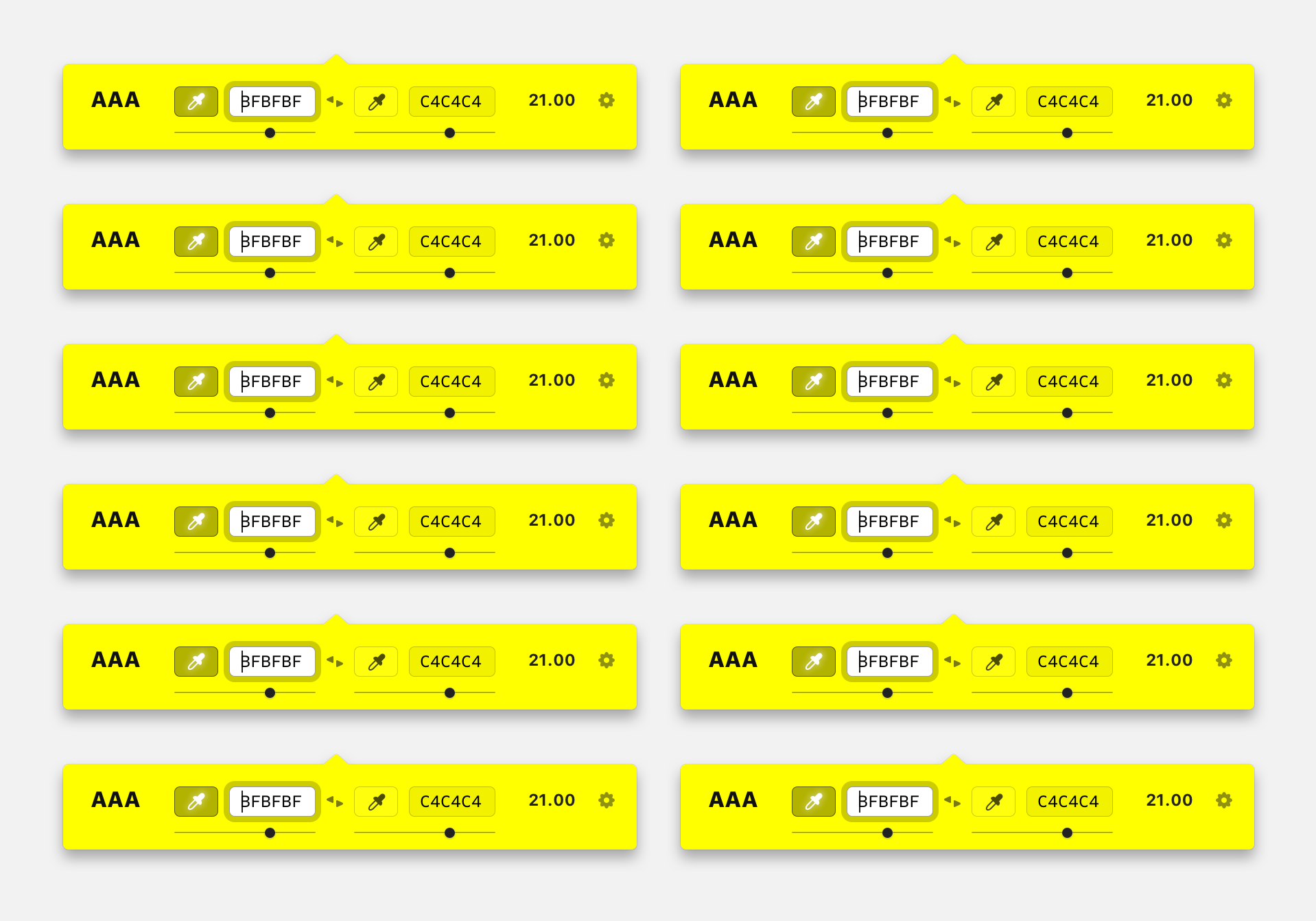
You can see they're all the same color. Now I went back into the symbols section and created a lot more color symbols using the same color/hex naming convention and same artboard size.
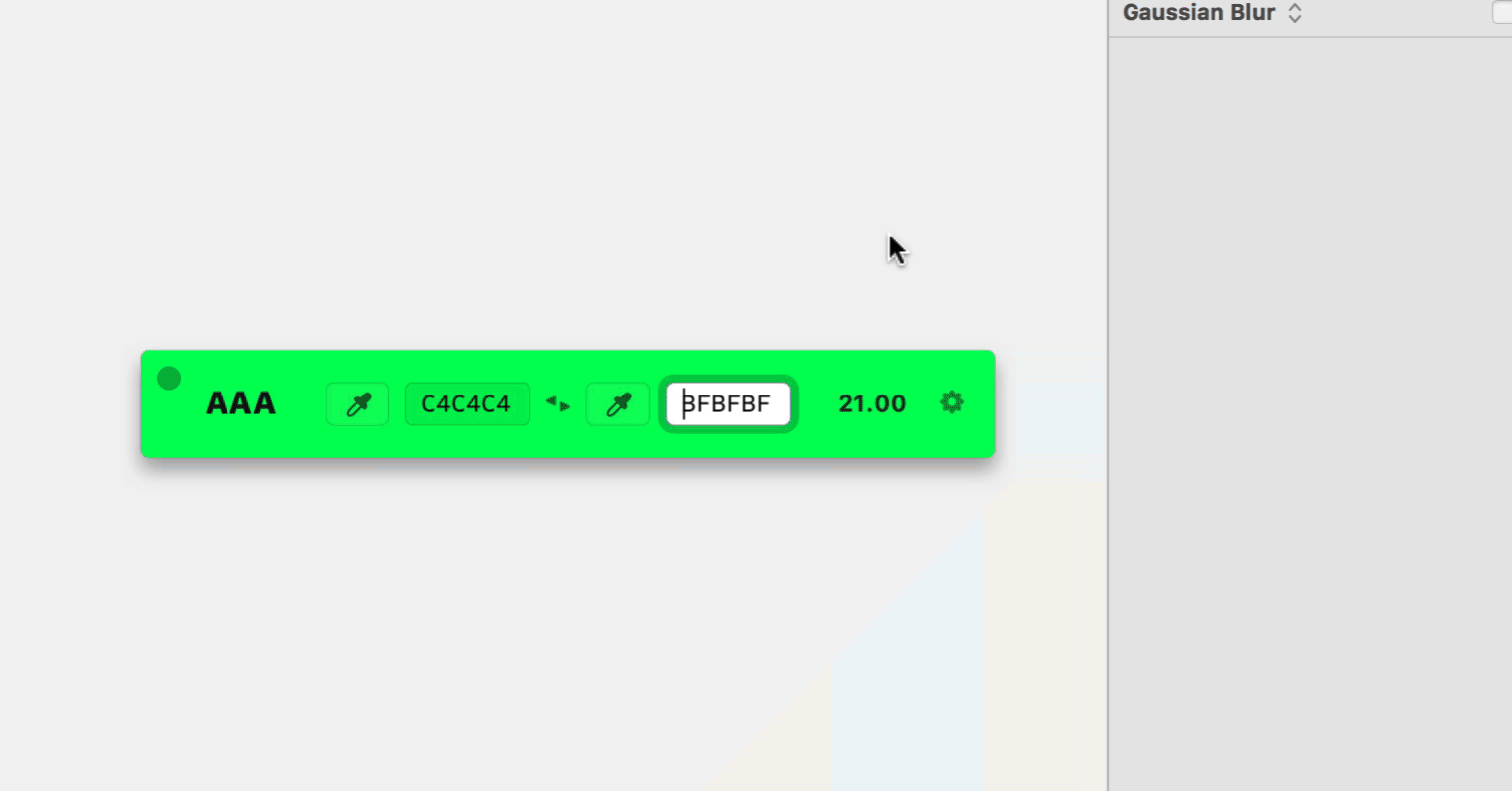
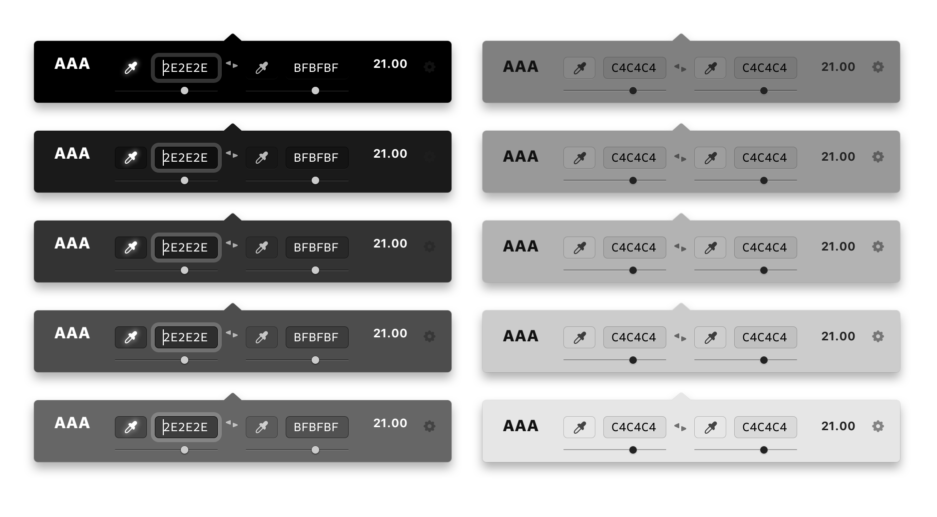
I went ahead and changed the background of every symbol making sure that I had a range of dark and light colored backgrounds.
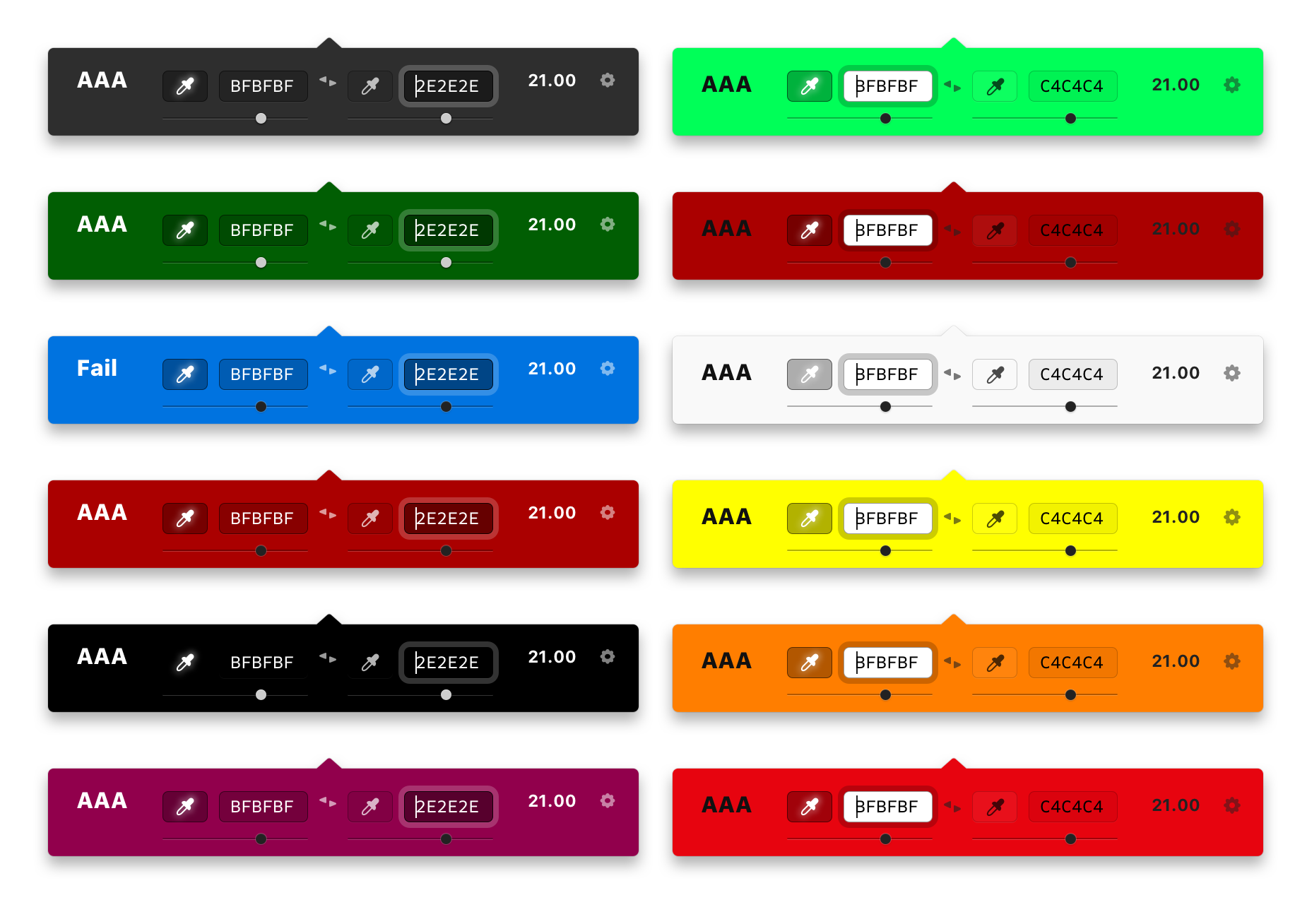
You can see from here that some of the UI components are starting to get lost, which is where the dark/light variations will help out.
I wasn't sure of the exact brightness scale of these colors, so I used my best guess as to which one needed light versus dark UI.
PRO TIP: You can select multiple instances of the same symbol and update nested symbols for every instance at the same time.
Design Hand-off
Now that the designs were pretty much finalized, it was time to hand-off the files.
I use Dropbox exclusively for all of my digital files and have an exquisitely organized folder structure for my projects. This made it super easy (as always) to instantly share my project with Sam.
I gave a quick walkthrough on how I setup the Sketch file, how the app was built using symbols, and where he could dig into each little piece of UI to find the information he needed.
PRO TIP: It's always a good idea to talk to your developer early and often about the project you're building. This will dramatically increase the quality and speed of what you build.
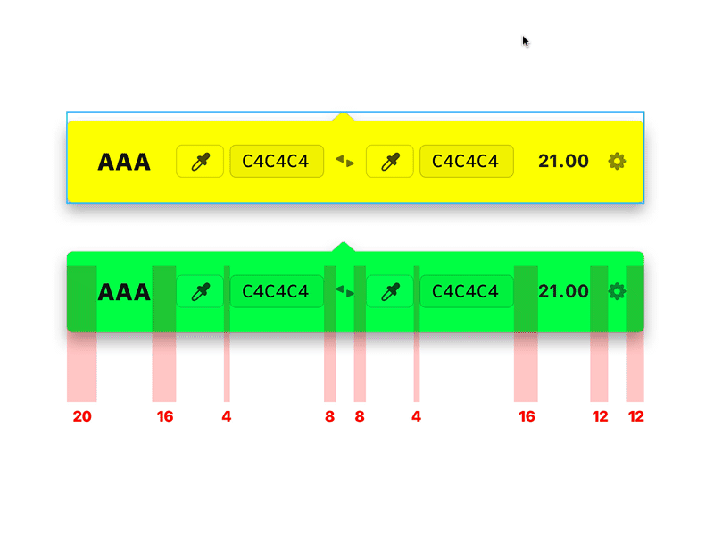
It's also worth noting that I used a pretty strict 4px mental system when laying out each component, making sure that every margin was divisible by 4. This is a pretty standard goto system for me. It works well for mobile app design as well as web stuff.
The App Store Icon
Ah yes, the beloved icon. We needed this. You know, the one that shows up in the actual App Store, in the Applications folder in Finder, etc.
Even though this is exclusively a menu bar app, we still needed the icon.
I started off creating a pretty boring black icon with a larger version of the menu bar icon at first.
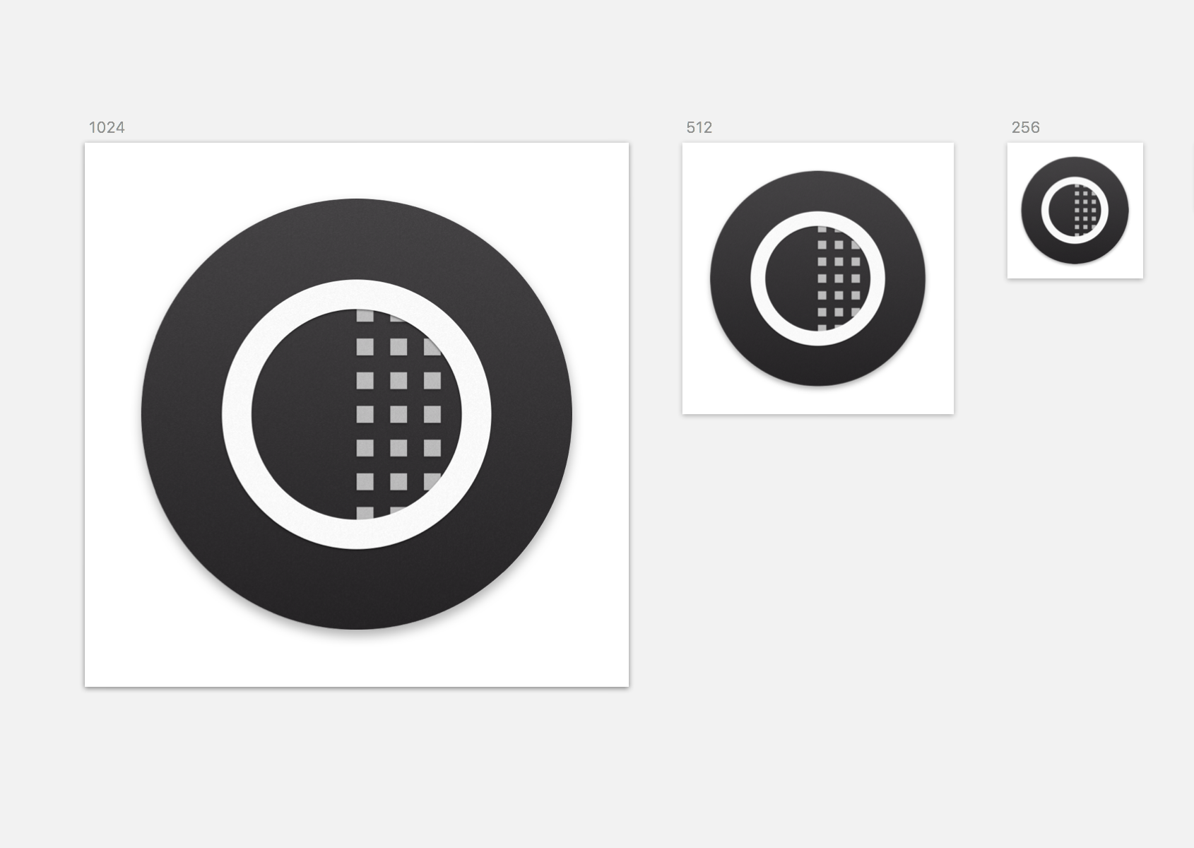
I knew we needed a better one eventually, but we were moving fast and I figured I'd make it better later. I mean, I made it as nice as possible for what it was, it just wasn't great.
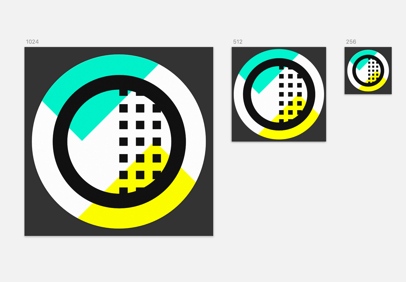
In the end, this is what I settled on, but it was only after a big design sprint for the marketing website.
The Loupe
Another big part of this little app is the ability to select a color with a loupe-style color picker.
I wanted to be able to pick any color on the screen, the same way you can quickly select a color using CTRL + C in Sketch.
Little did Sam know that when I mentioned this feature to him that it would be the bane of his existence.
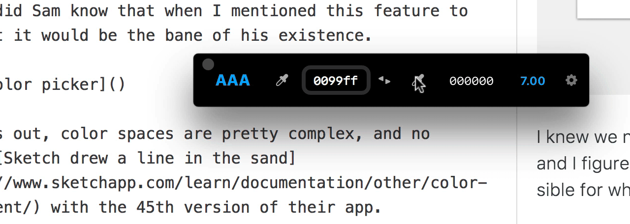
It turns out, color spaces are pretty complex, and no wonder Sketch drew a line in the sand with the 45th version of their app.
Entering a hex code in a field is a pretty fool-proof way to get measurements, but picking a color from your screen is 10 times harder, programmatically speaking anyways.
There were issues with the mouse leaving the loupe behind, then issues with wrong HEX codes getting picked during simple color tests.
Finally, after doing things with code that I could only hope my great grandchildren would do, Sam fixed everything with the color picker loupe.
There are still color space issues, but that's more of a general color issue at large rather than a bug in the app. For example the hex codes may be slightly off if used in Photoshop, unless you choose Display from color profiles.
But all other tests in Sketch, Figma, Illustrator, and XD passed with flying colors. Pun intended.
Hooray for colors!
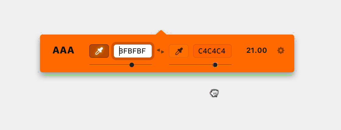
The Sliders
So in Brent Jackson's colorable demo, he's got these nifty little HSB sliders. Hue, Saturation, and Brightness. I find myself using the brightness slider the most to tweak and color just above a passing score from time to time.
And because the goal of this app is to stay tiny and out of the way, we decided it would be nice to have a brightness slider, but just leave the other ones out.
Before launching we decided that this would be better as a later feature. It's not critical for functionality and we did add the arrow key nudge up/down feature, which is almost better in my opinion.
Always best to draw a line in the sand somewhere so you can actually ship the product.
Mo' Testing Mo' Features
The feature ideas really don't stop. It's like a water hose. As soon as I started testing builds of the app and using during actual design projects, I found myself wanting to swap the background and foreground colors.
"I'll just design a little icon for that!" I thought to myself. So I did. Introducing the color swapper button. ;)
My gut said it would be less time consuming than some of our other ideas, so Sam graciously popped it in real quick. Thanks, Sam!
Sound FX
Back in the day I was OBSESSED with little clicks and pops in Flash websites. I had a huge library of sounds that I completely abused in all of my old and horribly awesome websites.
So when I saw that Glyphish released some pretty amazing sound effects, it rekindled my love for aptly placed sound within an interface.
Sidenote: Have you ever noticed how amazing the Facebook sound effects are? I don't see many people talking about sound in UI. Weird? It's an amazing way to add polish to your software.
I bought them and put them in our shared Dropbox folder for Sam to have some fun with. We bounced some ideas back and forth, tested a few out, and ultimately settled on a few little bips and boops all in the name of fun.
Download the App
Speaking of fun, you should totally go snag this app! We think it's pretty awesome and had a blast making it.
If you're making interfaces in any form or fashion this app was built for you. Designer? Developer? QA person? Yes you.
You can test the color contrast on design mockups, actual websites, keynote presentations, and anything else that's designed on a Mac.
Still reading this? Go get the app!