Download the source files here.
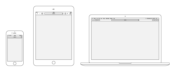
It can be difficult for a client to understand which screen design is which if you present your work without device context. Below is an example that shows the high-level wireframe layout for three major breakpoints.
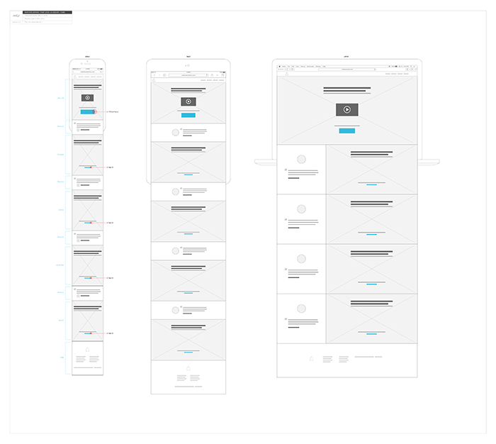
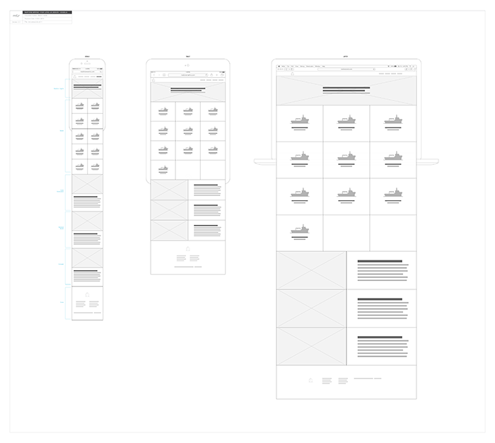
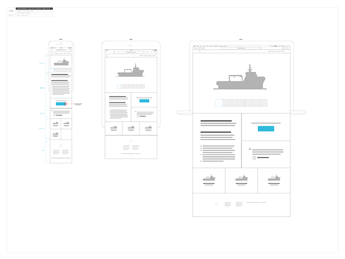
These aren't meant to be the governing authority on breakpoints that should be used within the final product, but rather a quick tool for helping sell your work, which is often just as important as the work itself.
If you can put together some wireframes like this to help tell the story of your responsive designs and get quick buy in from the client, then that's a huge early win that can help move the project in the right direction. This is also a great way to get on the same page with the developer, who can let you know quickly if he or she sees any potential problems with your design.
Download the source files here.
If you want to know how to create these for devices for yourself, check out these tutorials:
Check out the next post in this series, "High Level Wireframe Design Intro with Illustrator"